
Home » Posts tagged 'N. C. Wyeth'
Tag Archives: N. C. Wyeth

The Pirate Captain & His Burning Prey Upon the Background Billows: An Iconic Image

Arguably only a few illustrators have matched, and none have surpassed, Howard Pyle (1853-1911) for his iconic pirate images and their contribution to the modern myth of pirates and piracy. Whether of picturesque and picaresque buccaneers, or of pirate attacks, duels, buried treasure, or extortion of prisoners, his illustrations, with few exceptions, have inspired imitation and homage.
Of all Pyle’s strikingly evocative pirate art, his painting of Captain Keitt for his novella The Ruby of Kishmoor is considered by many to be the pinnacle of his work. We see it above: the pirate captain, clearly inspired by Captain Kidd, braced seaman-fashion on the poop of his pirate ship The Good Fortune in the trough of the sea, his prey, the Rajah of Kishmoor’s great ship The Sun of the East, burning in the background upon the crest of a swell, its mainsail shot to pieces.
The ship’s lantern rises behind the pirate captain, and curiously — and surely for reasons or artistic composition — behind it the ensign staff flying the Jolly Roger. I quibble here: the lantern would historically have been astern of the flagstaff, outboard of the hull, the other inboard. Curiously, the lanterns, and in fact the stern decoration and color, of both ships appear similar if not identical (and somewhat similar ones can also be seen on Disney’s pirate ship the Black Pearl).
Keitt wears an 18th century style cocked hat (aka tricorn) with gold trim, setting off his rather ratty black hair and long mustachios framing a stern face that hints of evil, an expression suggesting he might be posing for a painter, recalling perhaps the pirate portraits in Exquemelin’s The Buccaneers of America. Or perhaps he has been caught off guard, or has been asked a stupid question.
A ratty kerchief is tied around his neck rather than a cravat, and he wears a crimson just-au-corps, waistcoat, and long swashbuckling sash. His wide loose breeches are the seaman’s, and on his feet he wears boots of some sort, perhaps intended as “sea boots” although such were worn largely by fishermen and by seamen of this era only in cold weather. The boots are a deliberate cliché or trope: even more than a century ago the audience expected to see pirates in boots, though most often of those for riding with tops folded over. Pirates wore shoes and stockings or, especially if poor, went barefooted. The idea of “pirate boots” derives via popular illustrators from those of cavaliers and musketeers.
Hanging from a buff baldric is a Spanish “bilbo” style rapier with large curved shells although he would likely have worn a cutlass instead, and from a waist-belt. A short-barreled pistol is stuffed into the sash, and Keitt holds a speaking trumpet in his hand, perhaps with which to verbally abuse those victims doubtless left behind on the burning, sinking ship — he surely no longer has any need of the trumpet for hailing. Perhaps he uses it to bellow at his crew rather than pass orders via his subordinate officers.
There is a somber aspect to the painting: those aboard The Sun of the East who did not perish in the battle and boarding action have surely been left to the severe mercy of the sea.

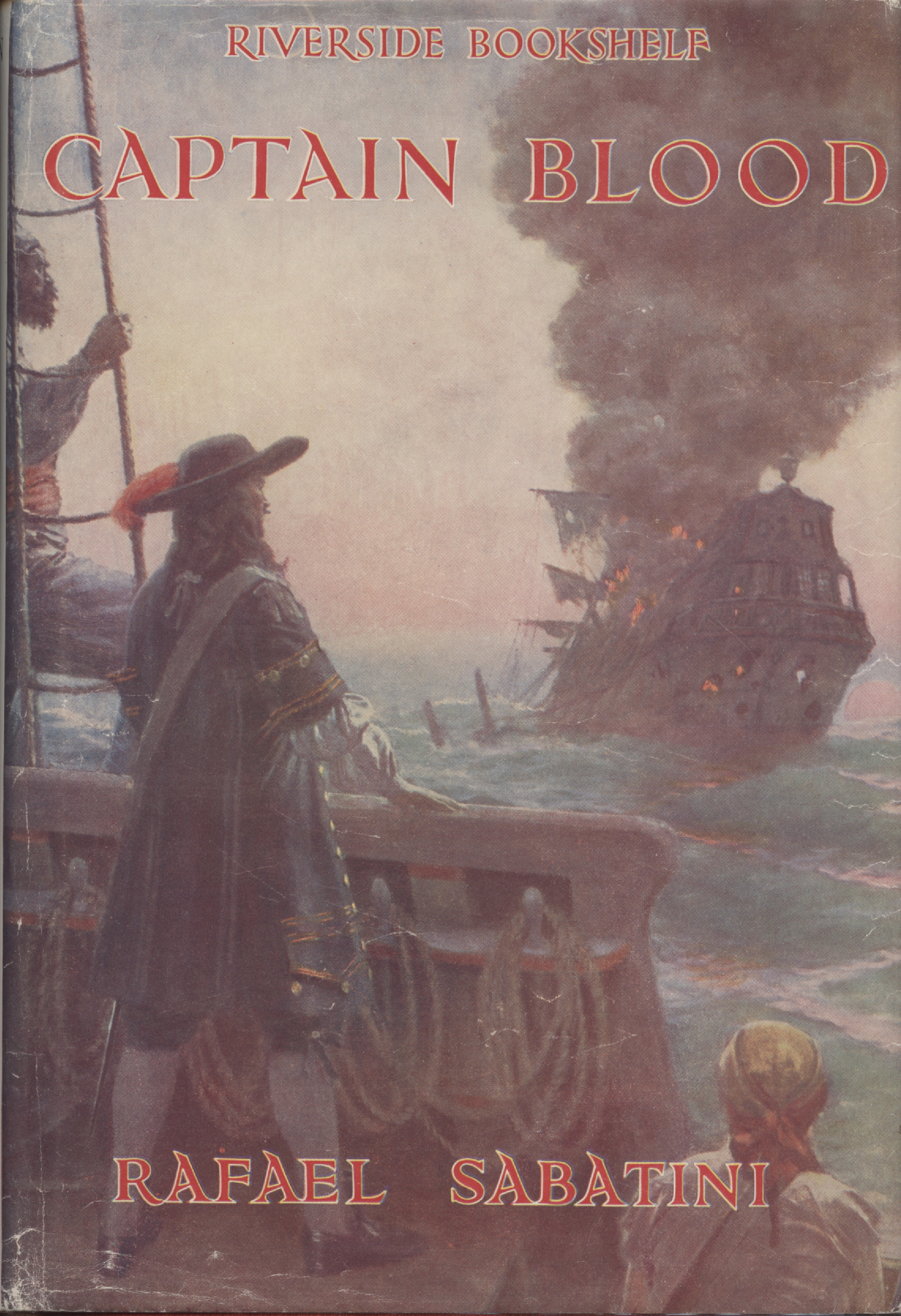
N. C. Wyeth’s frontispiece and dust jacket art for the US edition of Rafael Sabatini’s Captain Blood: His Odyssey (1922) is almost as famous as Pyle’s painting. Clearly an homage to his teacher’s famous painting, Wyeth’s work embraces the image of Sabatini’s eponymous hero, even if he depicts the famous literary buccaneer in more mid-17th century style rather than of the 1680s. It’s not entirely Wyeth’s fault. Foremost, he intends to evoke the novel and its hero, rather than portray them with complete historical accuracy. Further, Sabatini himself occasionally misuses terms for period dress, for example writing doublet when clearly he intends the just-au-corps, the long coat worn in the 1680s and after.
Still, Wyeth’s painting is true enough to the novel, and clearly he had read it. The illustration was first painted then later used for a novel because it was close enough, as with Wyeth’s dust jacket art and frontispiece for The Black Swan. In the painting above, Peter Blood’s hair and eyes are accurately presented — black and blue — and he has a small mustache as he did in the serialized novel but which he had lost when the novel was published.
He wears a doublet with silver-laced black sleeves, although this ought to be a black and silver just-au-corps. He wears a falling collar of Mechlin lace rather than a cravat of one, and a bullion-encrusted baldric. His hat is rather tall for the period but has the required crimson ostrich plume. The crimson feather is there to add color, but all in all Peter Blood’s dress is close enough to Sabatini’s description: “scrupulously dressed in black with silver lace, a crimson ostrich plume curled about the broad brim of his hat affording the only touch of colour.”
We can easily forgive Wyeth our quibbling criticisms, for, to repeat ourselves, the painting is intended to be figurative and evocative. It is, to quote a past editor of mine in regard to book illustrations, intended to entice potential readers to buy the book.
In the background a Spanish galleon burns, clearly an abandoned prize, although the burning of prizes, but for an English man-of-war (with a Dutch admiral, curiously) burned by the French, is not mentioned in the novel. Perhaps the image is of the Spanish fleet’s flagship Milagrosa which was to be “scuttled” after being defeated by Blood’s buccaneers. More likely, it is a generic image of one of the unnamed Spanish galleons captured by Captain Blood.
In practice burning was often easier than scuttling, particular with larger ships. Buccaneers did occasionally burn prizes, typically keeping some crew and passengers as prisoners while turning the rest loose in a boat, and occasionally sank smaller prizes as well. More often though they were likely to keep the prize or leave it with its crew and passengers, first cutting a mast down or taking some of its sails so that word of the buccaneers might not be swiftly carried to the nearest port.
Of note are the orange-gold clouds with red-black plumes of smoke in front. A sun, perhaps, setting on the galleon and Spanish Empire? Gold for plunder, and red-black for the two colors Sabatini repeatedly uses as themes in the novel?
From the 1927 et al Riverside Press Cambridge (a Houghton Mifflin imprint) edition of Captain Blood: His Odyssey, the dust jacket and front cover art by Clyde Osmer Deland (1872-1947). Although the painting is more historically accurate — no boots, correct just-au-corps and hat — it lacks the eye-catching flair of an illustration by Pyle or Wyeth, even if a burning sinking ship draws the eye. And again there’s that damned mustache that’s not in the novel! Here, Deland has no excuse, given that he painted the illustrations several years after the novel’s publication.
The ship is not burning in the illustration above, but the magazine cover was clearly inspired by Pyle and Wyeth’s paintings. The pirate depiction, in particular its resemblance to the much later Captain Jack Sparrow, is discussed here.

Another Wyeth painting hinting at an homage to his teacher Howard Pyle and which has influenced our idea of the pirate captain and his burning prey on the billows. The blue-green tropical sea is up, giving us the mountain-like billows we like to see — and which also aid in composition. The burning ship is clearly a Spanish galleon, of a style much-used by Wyeth and discussed here. That it has just been plundered is obvious: booty is piled on the poop, including a classic Pyle-style treasure chest with curved top. The buccaneer captain is almost identical to one Wyeth painted for the September 22, 1921 issue of Wall Street Number magazine, a Life magazine publication, discussed here.
The galleon rests on a crest, with the buccaneer ship below in the trough, suggesting the rover is sailing away. Classic Wyeth clouds frame the galleon, and the skull and bones — an anachronism — flies at the stern but we can see only the lower part of the field, as in Pyle’s painting at the top of the page, clearly an homage.

Yet another homage, this time Peter Hurd (1904-1984) to his teacher N. C. Wyeth. Although Hurd was best-known for his paintings and illustrations of life in the Southwest US, he edited and illustrated Marauders of the Sea, a collection of excerpts from pirate stories, 1935, with an introduction by N. C. Wyeth. In the painting, two ships are closely engaged, one of them afire. Here, the pirate captain is not standing the deck of his ship. Rather, the composition is clearly arranged after late 17th century paintings and illustrations of pirate and men-of-war captains and admirals, as will be discussed in more detail shortly.
Hurd’s pirate captain reminds us of the famous depictions of Exquemelin’s buccaneers shown farther below. His eyes are blue and his hair black, like Peter Blood’s, but he also has a Spanish-style mustache and a scar across his cheek. He wields a classic shell-hilt cutlass with large brass rather than iron shells, though all the large shells I’ve seen on cutlasses were iron — only smaller shells might be made of brass. His face is scarred, his jacket is either Spanish or an earlier English doublet, and he wears breast and backplate which Peter Blood did fictitiously and some captains of men-of-war did in reality. Whether any buccaneer captains actually did is entirely speculative, for there is no record of them doing so.
Other Notable Homages
I’ve chosen one authorized imitation of Wyeth’s “Captain Blood,” one authorized inspiration of the Pyle/Wyeth paintings, and also several notable homages, five of them to Howard Pyle’s “famous painting at the top” Captain Keitt,” and rest to Pyle and perhaps to Wyeth and others as well — an homage to homages and to the original.


Three illustrations by George Alfred Williams, the first from The Boy’s Book of Pirates and the Sea Rovers by George Alfred Williams (New York: Frederick A. Stokes Company, 1913). It is a likely homage to Pyle’s painting — and only five years afterward. The second and third are from The Pirates of Panama or The Buccaneers of America by John Esquemeling (New York: Frederick A. Stokes, 1914). Both are clearly homages to Pyle’s famous painting. All three doubtless contributed to the image of the iconic image of the pirate captain and his burning ship on the background billows.


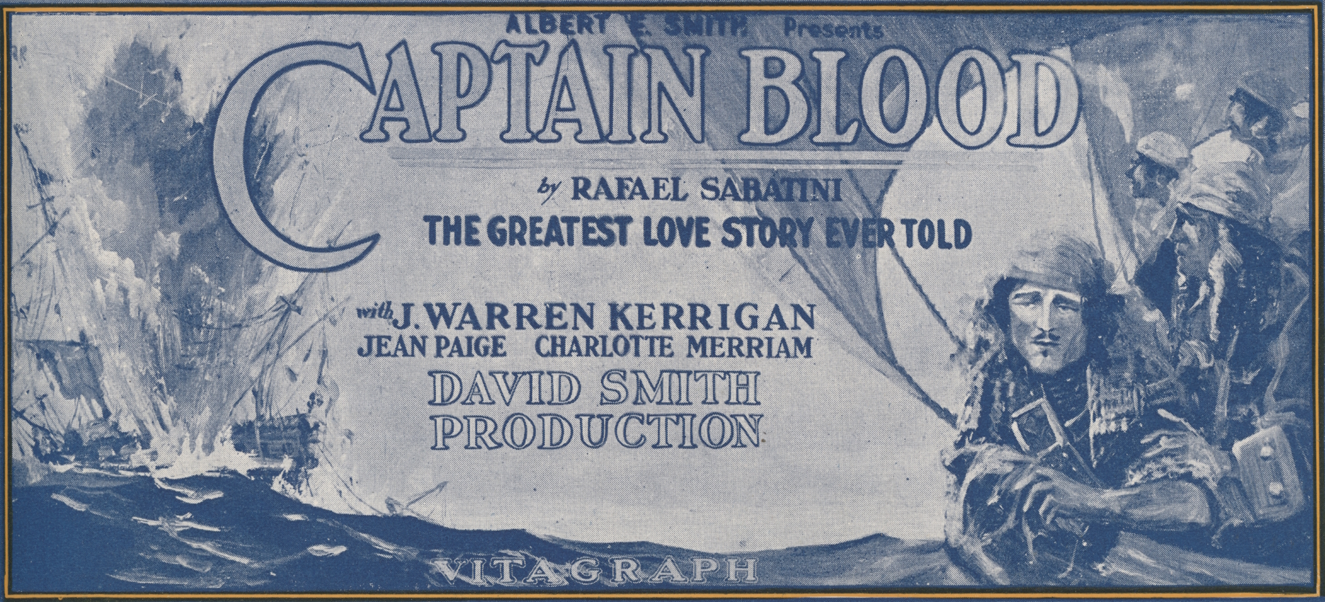
The first image of the four just above is the front cover of the program for the 1924 film version of Captain Blood (Vitagraph) at Astor Theatre, Broadway and 45th, in New York City. The image was also used on a poster for the film. The cover style has been copied from a combination of the dust jacket of the 1922 US release of the novel and of the front board of the book. I’m no fan: here Captain Blood looks more like an unadventurous bourgeois dressed as a pirate for a costume party, rather than the long, lean, hawk-faced adventurer-physician-buccaneer described in the novel.
The likeness is intended to represent J. Warren Kerrigan who played the starring role. Perhaps the unknown illustrator was getting a dig in at Kerrigan and felt the same way I do about him. The actor famously told The Denver Times during the First World War that “I am not going to war. I will go, of course, if my country needs me, but I think that first they should take the great mass of men who aren’t good for anything else, or are only good for the lower grades of work.” Clearly he was no Sabatini-esque hero in real life, nor even an Errol Flynn, at least in regard to courage, panache, dignity, and empathy.
The bottom image is a copy of one of the many posters designed for the 1924 film, clearly inspired by both Pyle and Wyeth. Atypically, the ship is exploding rather than simply burning, although the latter often led to the former.
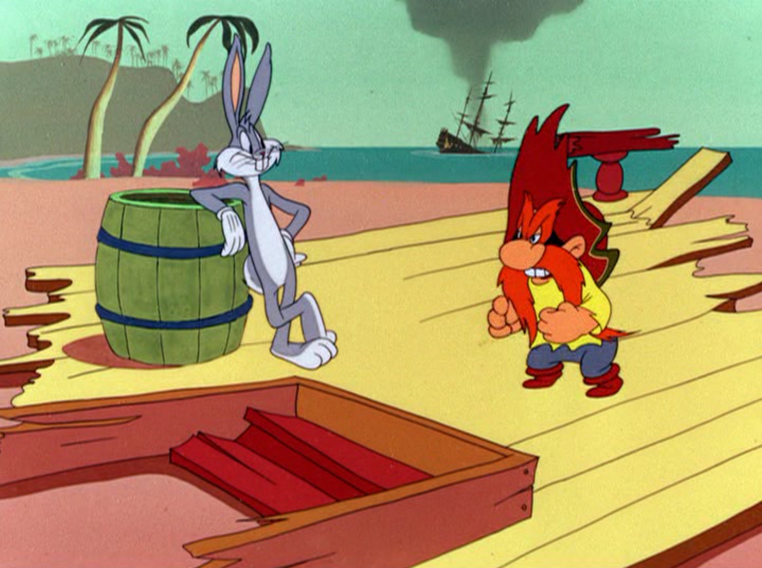
The writers and artists of “Buccaneer Bunny” (Warner Bros. Looney Tunes, 1948) clearly intended an homage to Pyle and Wyeth. It’s basically a reverse or mirror image of the Captain Blood cover art and frontispiece done by N. C. Wyeth. DVD screen capture.

Above is a possible homage to Pyle and Wyeth: Errol Flynn as Brian Hawke just having rescued Alice Kelley as Princess Padma from the burning ship of the Mughal Emperor. Compare with The Goonies screen capture below.

In the painting above there is no burning ship, but one firing a broadside instead. Even so, the image is clearly inspired by the paintings of Pyle and Wyeth, and as much by the illustrations from Alexandre Exquemelin’s The Buccaneers of America discussed below. The painting, artist unknown but suggested by some to be Ed Kohn, has hung for many years in the Pieces of Eight store adjacent to the Pirates of the Caribbean ride at Disneyland. Originally it hung in the Pirates Arcade Museum (mostly an arcade) before the shop replaced it in 1980. It may depict Fortune Red, the animatronic fortune teller in the arcade.

Above, an homage if you like, and clearly a comic riff, on Pyle’s famous painting. A damsel-in-distress has been added — and Chunk’s tongue too… From the attic scene in The Goonies, 1985. Compare with the Against All Flags screen capture above it.
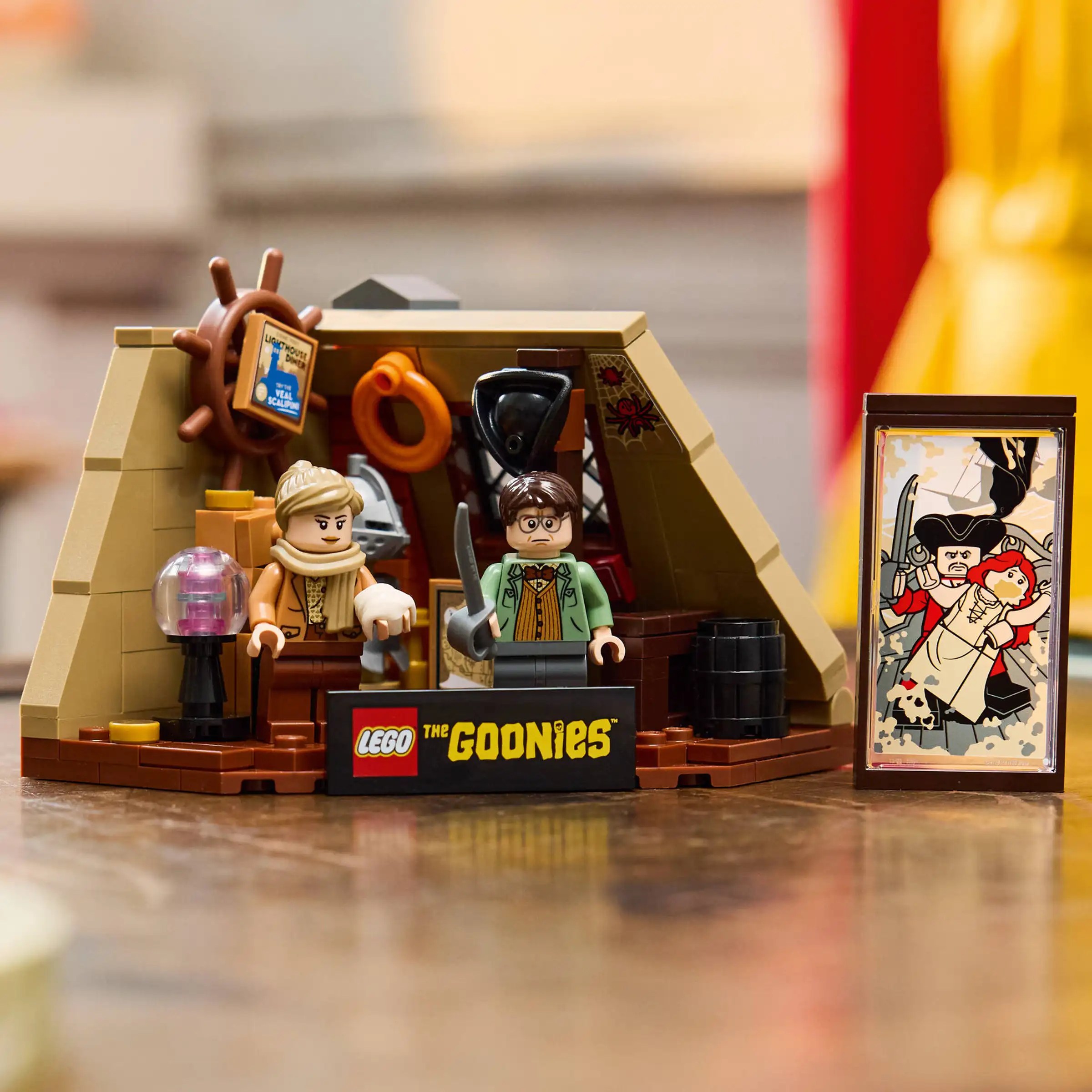
The Goonies painting as imagined by Lego, part of a kit (“The Goonies: The Walshes’ Attic”) to accompany The Goonies ship and the film scenes depicted inside.

I hesitated to post the image above, of Arnold Schwarzenegger as Captain Blood by William Stout. The film was under consideration in 1994, and, although I have great respect for the former Governor of California as an action hero, I am overjoyed that the film never made it into production. The proposed script was of a sort commonly pitched by studio executives, producers, and screenwriters: one intended solely to make money (art, artist, and audience be damned).

Above is an homage by arts and entertainment polymath Jim (James R.) Silke (1931-present) to Howard Pyle’s famous painting (see “After Howard Pyle” below the signature on the painting above) featuring Maureen O’Hara as Spitfire Stevens in Against All Flags (1952), also starring Errol Flynn. The 2005 work was created as a commission for Brian Peck.

My good friend Antón Viejo Alonso brought the image above to my attention. Drawn by noted portrait artist and film costume concept illustrator Darrell Warner for Pirates of the Caribbean: Dead Men Tell No Tales (Disney Studios, 2017), it is clearly an homage to the Howard Pyle painting at the top of the page.
A cropped image from Netflix’s live action 2023 release of One Piece, with pirate-captain-to-be Monkey D. Luffy (played by Iñaki Godoy) in the foreground (foresea? :-)) with a burning ship in the “backsea,” clearly an homage to Pyle, Wyeth, et al. Furthering this argument is the fact that the scene with burning ship is not in the original manga written and illustrated by Eiichiro Oda nor in the anime based on it produced by Toei Animation. (N. B. there is a similar scene when the [Spoiler Alert!] Going Merry burns and sinks much farther along in the voyages of the Straw Hat Pirates, which is perhaps an homage [Spoiler Alert!] to Peter’s Blood’s loss of his beloved Arabella).
Inspirations & Influences
The most likely inspiration — the seed planted in the subconscious — might well be some of the original illustrations in Alexandre Exquemelin’s early Dutch, Spanish, and English editions of The Buccaneers of America. They include several portraits of famous buccaneers, although we have no idea how accurate the depictions are, but this matters little in regard to inspiration.
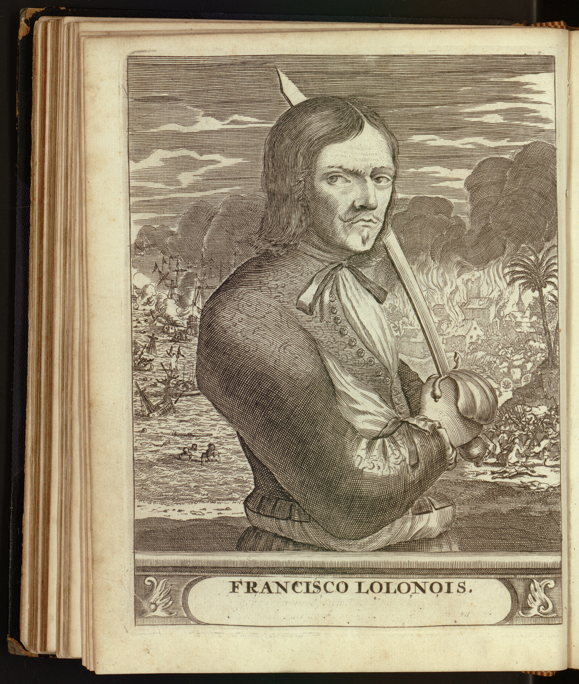
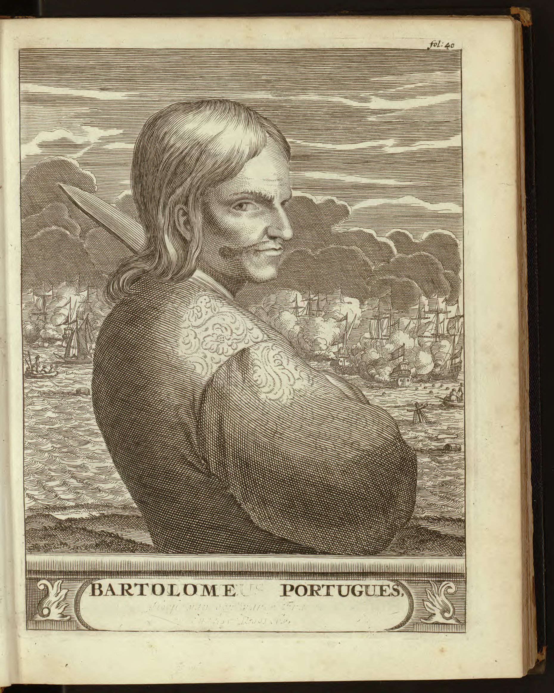

The three illustrations above are Spanish edition copies of the originals in the Dutch 1678 edition: Francois L’Ollonois, Bartholomew Portuguese, and Henry Morgan. All show battles, including sea fights, raging in the background, with billowing smoke suggesting that some ships may be afire. None of these buccaneer captains — as far as we know — are standing on the the decks of the ships. It took Howard Pyle’s genius to compose a portrait evoking the adventure and romance, at least as we believe it to have been, of piracy on the high seas.
The illustrations in Exquemelin’s books were doubtless inspired by a common form of portraiture associated with fighting seamen and soldiers, officers in particular for typically only they could afford portraits or had enough social status that a patron might commission a portrait of them.
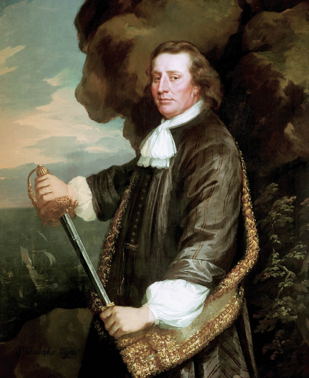
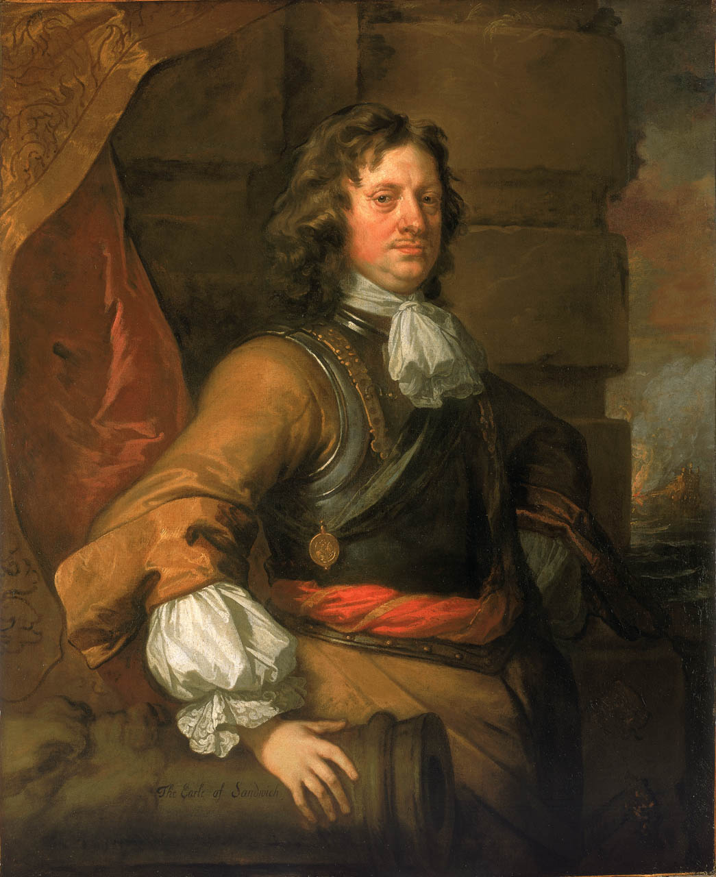
The two portraits above are typical of those of the era: the subject in the foreground, with a depiction of a major associated action in the background. Myngs, prior to becoming an admiral, led a number of raids on the Spanish Main, with buccaneers-as-privateers as his consorts, after the English captured Jamaica from Spain. The portrait of Montague shows us a burning ship, but it may not be that of an enemy. It appears to be of English build, and is therefore more likely the HMS Royal James, Montague’s flagship burned by a Dutch fireship in 1672, resulting in Montague’s death.

Not quite yet a buccaneer or pirate in the photograph above, nor yet a burning ship on the background billows — but aspirations enough. 🙂
Copyright Benerson Little 2024. First posted 24 September 2024. Last updated November 1, 2025.

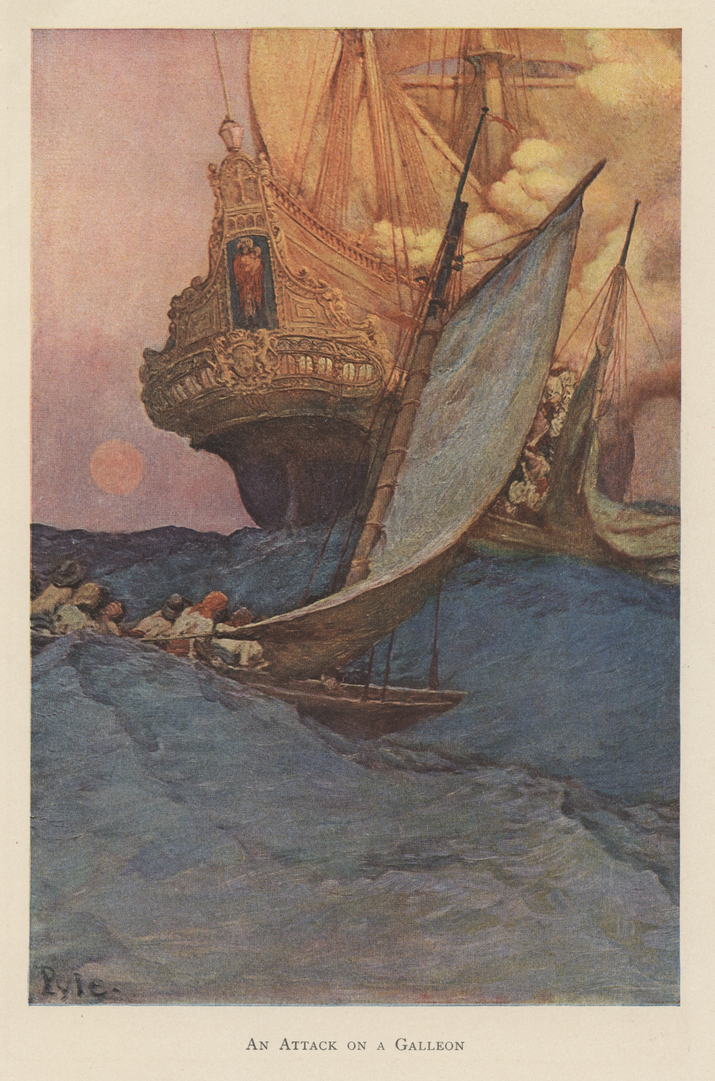
Howard Pyle’s Famous “An Attack on a Spanish Galleon” — and Some Real Galleons Too!
Perhaps the most famous of Howard Pyle’s many piratical paintings and drawings, and certainly the most evocative, “Attack on a Spanish Galleon” has inspired many homages (and plagiarisms) in book illustrations, cinema, and advertising — not mention dreams of Spanish treasure in the minds of both armchair and real sea-going adventurers!
The illustration accompanies several other of Pyle’s most famous buccaneer paintings in “The Fate of a Treasure Town,” an article written by Howard Pyle about the 1697 sack of Cartagena de Indias and published in Harper’s Monthly Magazine, December 1905. The article includes some of Pyle’s most famous buccaneer paintings, including “The Buccaneer was a Picturesque Fellow,” “Extorting Tribute from the Citizens” (used as the cover of The Buccaneer’s Realm, for what it’s worth), and “So the Treasure Was Divided.” Of the most famous paintings of his buccaneer, as opposed to pirate, series, only “Which Shall be Captain?” for “The Buccaneers,” a book of poetry, by Don C. Seitz in Harper’s Monthly Magazine, January 1911, and “How the Buccaneers Kept Christmas,” in Harper’s Weekly, December 16, 1899, are missing.
Charles D. Abbott in Howard Pyle: A Chronicle (Harper & Brothers, 1925) considers these four paintings as the culmination of Pyle’s paintings in “the pirate vein,” although he argues that the painting of “Captain Keitt, standing on the slanting deck of ship with a high sea running behind and a burning galleon in the distance, is perhaps the best of all of Howard Pyle’s pirate pictures.” Even so, he notes that “The one called ‘Attack on a Galleon,’ with its marvelous golds and greens, is a splendid achievement in design.”
Although the attack on a galleon scene in illustration, fiction, and film in general was surely inspired by buccaneer-surgeon-author Alexandre Exquemelin’s The Buccaneers of America (first ed. 1678), Pyle’s was likely factually-inspired by Exquemelin’s possibly apocryphal tale of Pierre Le Grand who captured a Spanish treasure ship by boarding at night. The small buccaneer crew had only one craft and boarded by stealth, catching the Spanish captain and crew off-guard — they had disregarded the distant buccaneer craft as of no threat to a great galleon.
The story may be apocryphal but it has the ring of truth. We know that historically other buccaneers captured Spanish vessels by boarding from small boats, canoes, and periagers (piraguas, pirogues), that sea rovers in general have successfully made similar attacks over the millennia, and that modern naval special operations forces use the tactic as well. (For more information on the tactics of Golden Age buccaneers, pirates, privateers, and naval commerce raiders, see The Sea Rover’s Practice.)
In the painting, one buccaneer boat is already alongside, its boarders streaming up the side and into the waist, and another, gaff-rigged, a dugout canoe perhaps, is captivatingly astern, surely preparing to board as well. The smoke billowing from the deck indicates a fierce fight on deck — muskets and pistols, and probably the upper deck great guns and swivel guns as well, are in action — or possibly even that the ship may be afire, although in the latter circumstance it is unlikely that buccaneers would board, for a fire aboard ship was feared more than any other hazard of the sea.
At the stern, probably on the poop deck, one can sea a Spaniard in a broad Spanish hat, often referred to as a “two-hand hat” (or perhaps it is one of the buccaneers instead?) and aft of him, perhaps on the poop-royal (also known as the topgallant poop, Sp. chopeta/chopa/imperial, Fr. dunette sur dunette/carrosse), a pair of hands in submission and supplication.
A question that continues to perplex me is what time of day does this attack take place? Is that a golden full moon just up over the horizon at sunrise, given its red-orange color? Or is it a sunset, suggesting the setting and settling of a Spanish treasure voyage? Or even of the Spanish Empire in the Americas?

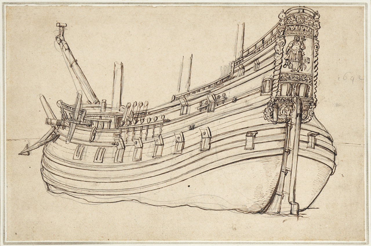
From the left drawing above it’s easy to see that Pyle changed the early conception of the galleon’s stern, eventually elongating it greatly for effect. Even so, the stern is historically-based. Without any doubt, as his inspiration Pyle used the well-known illustration, shown below, by 17th century Dutch artist Wenceslaus Hollar in 1647, and with poetic license narrowed the stern even further. Not only is the Hollar drawing quite similar, but Pyle used it in a later illustration, copying it almost exactly.
The illustrations by Hollar below show a form of mid-17th century Dutch ship used for both East and West India voyages. By the 1660s Dutch sterns, had become a bit lower and less narrow at the upper transom. Even so, some of the East and West India-men shown below, built in the 1640s and 1650s, would have survived in the 1660s and even 1670s or later. Importantly, approximately one third of Spanish ships were Dutch-built, including some treasure ships sent to the Americas, making Pyle’s Dutch-style Spanish galleon historically-correct, or largely so.


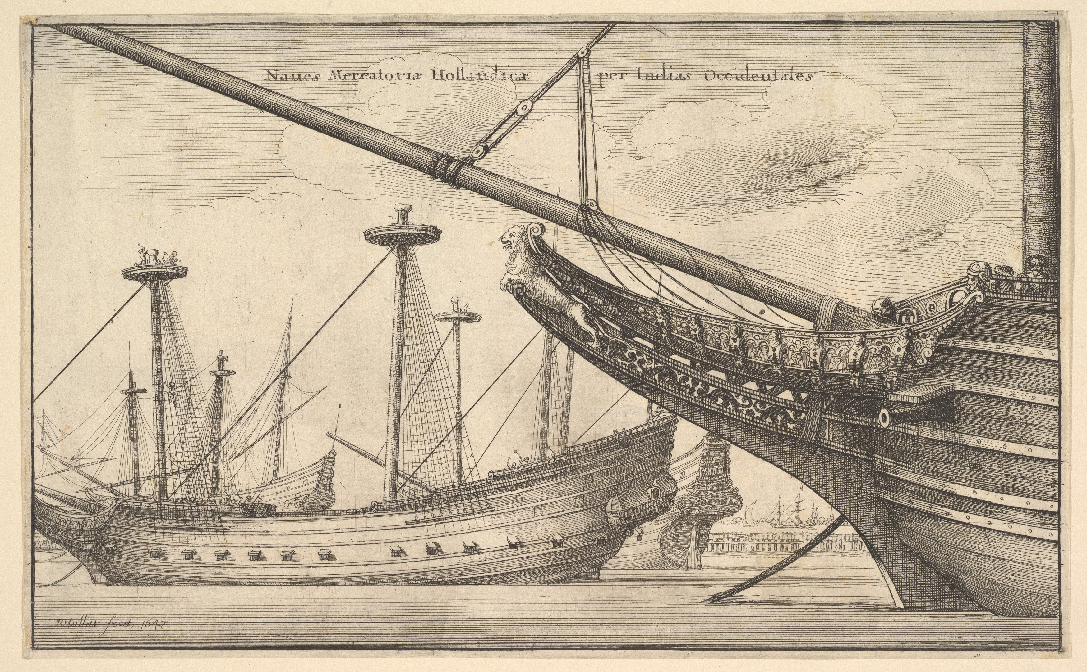

In the comparison above, Pyle has largely kept the structure and decoration with minor modification. Importantly and correctly, he has added a large Catholic religious icon representing the ship’s name at the stern. This was the usual practice aboard Spanish ships of the era, nearly all of which had religious names although some had secular nicknames. So far, the only exception I’ve found to the religious name rule is among some Spanish privateers. Occasionally, a religiously-named Spanish privateer or man-of-war might display the Spanish arms as its main icon at the stern, but it would still display a religious icon representing its name somewhere below or above the arms. Here we can assume that Pyle’s galleon’s name begins with Nuestra Señora given that the icon appears to be of Madonna and Child.
It’s possible that Pyle may have been originally inspired by “Wager’s Action off Cartagena, 28 May 1708” by English painter Samuel Scott. Painted at some point in the 1740s, Scott depicts a classical 17th century Spanish galleon, although in fact the galleon in question, the San Jose, whose remains along with possibly a billion dollars in treasure, are currently undergoing careful salvage off Cartagena de Indias, Colombia, probably looked nothing like this. (Details in the section below on real galleons.) In any case, Pyle may have been familiar with this famous painting, and sought out similar but more detailed images, and found those of Hollar. Notably, Pyle’s billowing smoke and orange colors are similar to Scott’s. (Compare with the image of what is probably the San Jose’s actual stern later in this post.)
A word or two on the term galleon. Originally, in the late 16th and early 17th centuries, it referred to a stout ship with specific characteristics that was built for war and trade. Spanish galleons were noted in particular for their very high sterns. By the late 17th to early 18th centuries the term galleon could refer to (1) in its narrowest definition, a treasure ship of a type built to very specific guidelines for use in the Carrera de Indias (the trade to the Spanish Americas from Spain and from the Spanish Philippines), (2) any Spanish treasure ship of any sort, (3) any Spanish ship with a very high stern and multiple stern galleries, and (4) any ship of war or trade similar to those of Spanish galleons, in particular those of Portugal (occasionally still referred to as carracks as well), Venice, Genoa, and “Turkey” (the Ottoman Empire).
Further, some Spanish officials in the late 17th century incorrectly referred to Spanish men-of-war of the frigate type as galleons, retaining language from earlier in the century. True Spanish galleons, as described in (1) were largely no more by the 1640s except for a small number specifically built for the treasure fleets. Arguably, the last true galleons, and there were but few by this time, were built in the 1690s, yet privateer Woodes Rogers in A Cruising Voyage Round the World (1712) describes one in the first decade of 18th century in the South Sea (the Pacific Spanish Main): “[S]he was call’d the Ascension, built Galeon-fashion, very high with Galleries, Burden between 4 and 500 Tun…” He later refers repeatedly to the ship as a “Galleon” — and oddly, to neither of the Manila galleons as galleons, but only one or the other as the “Manila Ship.”
Although the life of a ship in this era was often less than twenty years, some were in use for thirty to forty years, ensuring that older forms of ships were still well-represented.
Pyle also painted a somewhat similar illustration in 1898, published eventually in Collier’s magazine, December 10, 1904, and it clearly shows that his inspiration was taken from Hollar’s Dutch East Indiaman.


Imitations & Homages
Pyle’s galleon, or its inspiration, has spawned numerous imitations, right down to the present. Many, most perhaps, are homages. Below are a few representative images.
His treasure ship has often been used in advertising, for example in this add from The Saturday Evening Post, October 22, 1927, for 1847 Rogers Bros Silverplate. “Time and Tides are Kindly to Comely Captain Housewife,” reads the caption. Sexist, yet the series of ads does feature a variety of often clearly independent pirate women as opposed to more common images of domesticity. Doubtless the illustrations of sexy pirate women were intended not only to attract the attention of women readers, but also as lure to inspire husbands to buy the cleverly marketed “Pieces of Eight” set of silverware and associated pieces.
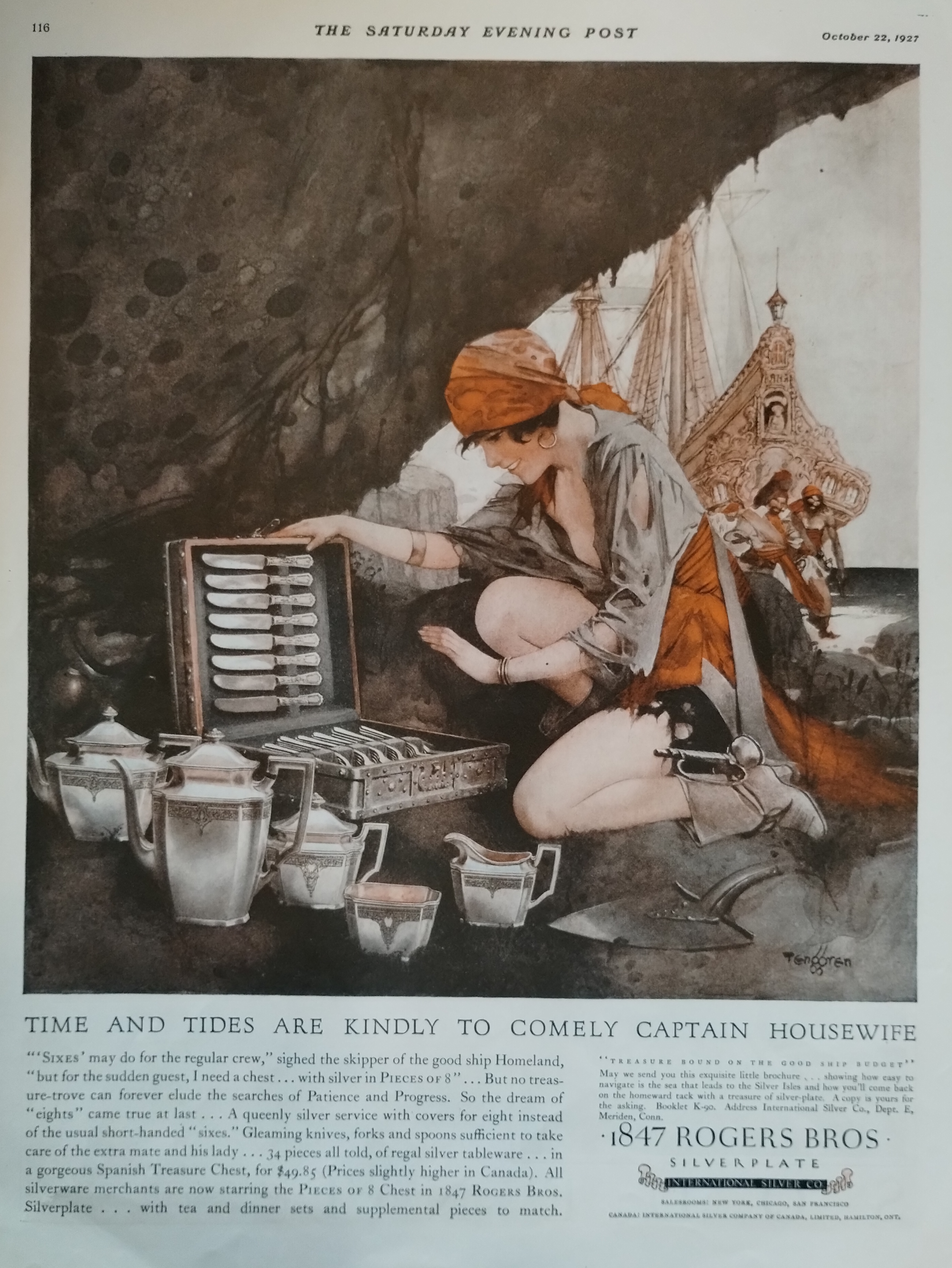
The detail below clearly shows the galleon to be a copy of Pyle’s famous ship. An homage, probably, but also good marketing, immediately evoking the pirates and buccaneers of Howard Pyle and Douglas Fairbanks.

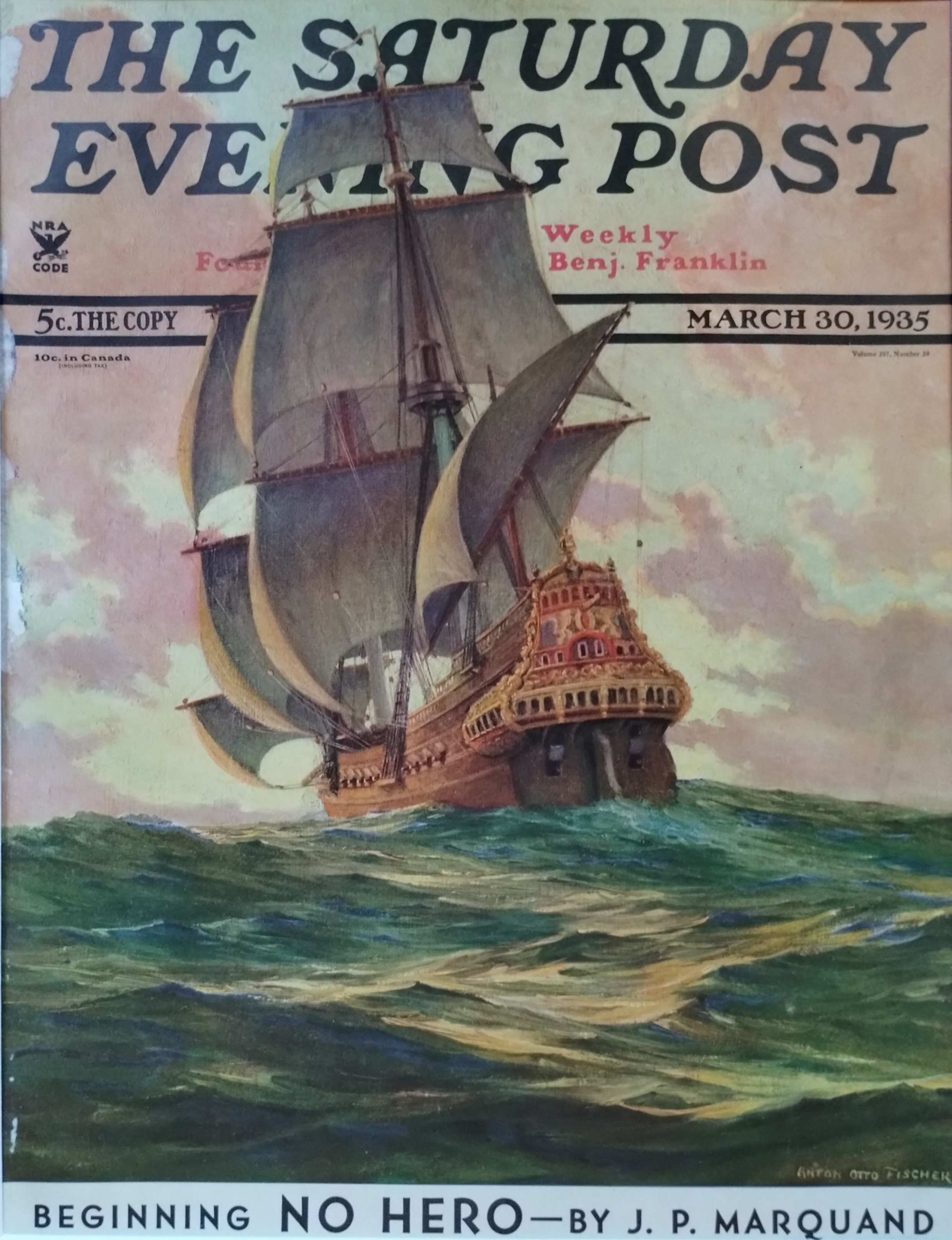
Below is a galleon by well-known Saturday Evening Post artist Anton Otto Fischer, quite clearly in homage to Howard Pyle, based on the galleon in Pyle’s “The Burning Ship” and Hollar’s India-men. The image emphasizes pink-gold hues of ship and cloud and tropical blue sea. Both Fischer and his wife were students of Howard Pyle; Fischer was also an experienced tall ship sailor whose favorite subjects to paint and illustrate were of ships, seamen, and the sea.
A dinner plate dating from 1923 – 1936 — an era of cinematic pirate adventurers Douglas Fairbanks and Errol Flynn, and the buccaneer novels of Rafael Sabatini and Jeffery Farnol — shows likely influence of Howard Pyle’s galleon. That said, as seen above and below, there were real ships with similar sterns.


I almost forgot about several famous galleons, at least one of them an English one, all painted by N. C. Wyeth — perhaps Howard Pyle’s most famous student. All clearly evoke Pyle’s galleon. Homages from student to teacher, without doubt.


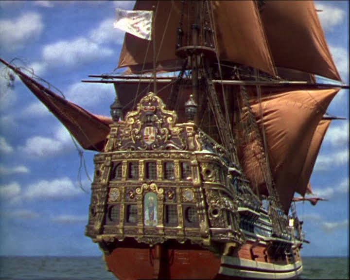
I cannot decide if the Cinco Llagas aka Arabella of the 1935 Captain Blood was inspired by Pyle’s painting or not. Without doubt the designers were familiar with Pyle’s galleon, although technically the Arabella is a frigate.

Likewise the Wicked Wench, which was clearly inspired by the Arabella, as I’ve discussed here.

Even so, the galleon — surely the Arabella! — in this 1935-1936 Spanish poster for Captain Blood (Warner Bros., 1935) was copied from or inspired by Pyle’s famous galleon. And appropriately so, given Pyle’s overwhelming influence on pirate films of the era. Note that the forecastle appears to have been appropriated from any of many N. C. Wyeth Elizabethan galleons, or even earlier galleons.

The stern of the Spanish galleon in The Spanish Main (1944) starring Paul Henreid and Maureen O’Hara may well have been influenced by Pyle’s painting, in particular the ascending pointed carved decoration at the top of the stern transom. Compare with that of the Urca de Lima in the television series Black Sails later in the post.
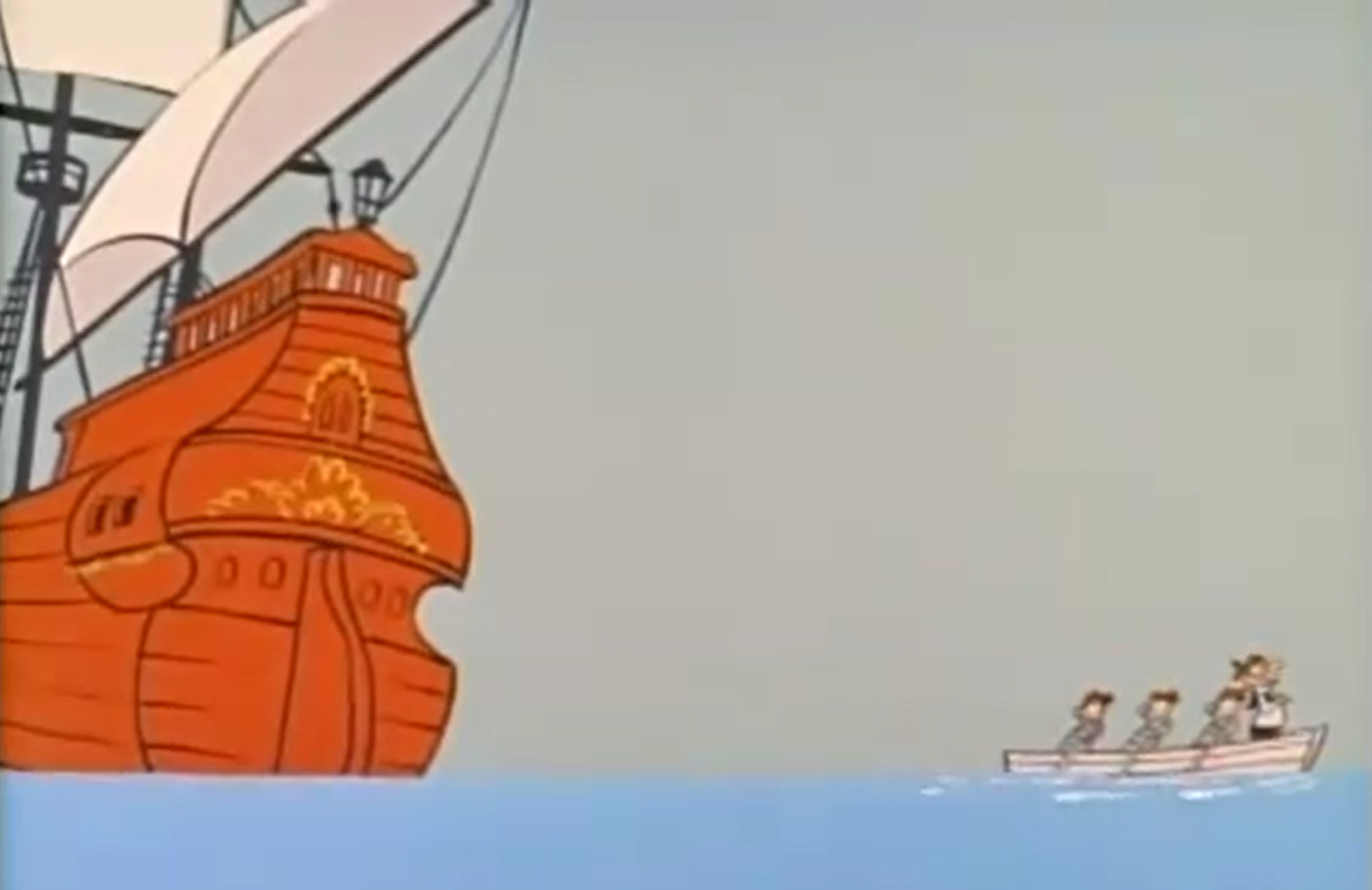
Pyle’s influence is clear in this shot from a Quick Draw McGraw cartoon from 1961:
Famous science fiction and fantasy illustrator Frank Frazetta honored Howard Pyle with an homage to his famous galleon in 1973.

N. C. Wyeth’s grandson, Jamie Wyeth, a famous and outstanding painter in his own right and son of iconic artist Andrew Wyeth, did the artwork for the plate below, a clear homage to both his grandfather and to the man who taught his father, Howard Pyle. In this case it is a “pirate galleon” — clearly a Spanish galleon fallen into the hands of buccaneers per classic trope. (N. B. Buccaneers didn’t fly the black flag with skull and bones, although at least one crew did fly the red banner of no quarter with skull and bones. But it’s the image that counts in storytelling, and we’ve come to expect the black flag on all pirate ships of all eras. See The Golden Age of Piracy for more details.)


Almost certainly the “galleons” (they appear to be manned with English marines) below, especially the one of the left, in this art by cartoonist François Ruyer for a puzzle is an homage to Pyle’s famous painting, with their excessive height and pirates attempting to board one of them via boat. Even the sky color evokes Pyle’s painting.

Likewise an earlier image by Jean-Jacques Loup for Heye, “Captain Flint’s Party,” for a puzzle evokes galleon sterns reaching for the moon, so to speak:

The stern of the Jolly Roger below from Peter Pan (2003) is clearly an homage to Pyle’s galleon.

It’s entirely possible that Pyle’s galleon even influenced the design of the Urca de Lima in the Starz dramatic series Black Sails, shown below. (Compare also to the galleon used in The Spanish Main above.) Although I was the historical consultant for all four seasons, I don’t know this for certain as I had no input into sets, including ship design, unfortunately — otherwise the ships might have been more historically accurate. Some of them in reality would not have been seaworthy.
And on a nitpicking the note, urca is the Spanish word for a type of ship originally designed by the Dutch but in use by all Western European seagoing nations. It was known as a fluyt, flute, flutte, or, in English, a pink. It had a rounded stern, not a flat one as the television galleon has, and a very small narrow transom (which might have provided some additional excuse for Pyle’s very narrow upper section of the transom for his Spanish galleon, even though it’s not an urca). In other words, the Black Sails galleon should be an urca instead. It bears noting that an urca is NOT a galleon — yet one might be referred to colloquially as a Spanish galleon if carrying Spanish treasure…


But I digress a bit under the influence of historical accuracy! Even so, this brings us to a good subject: what did Spanish galleons and their sterns actually look like from 1650 to 1700?
Spanish Galleons 1650 to 1700
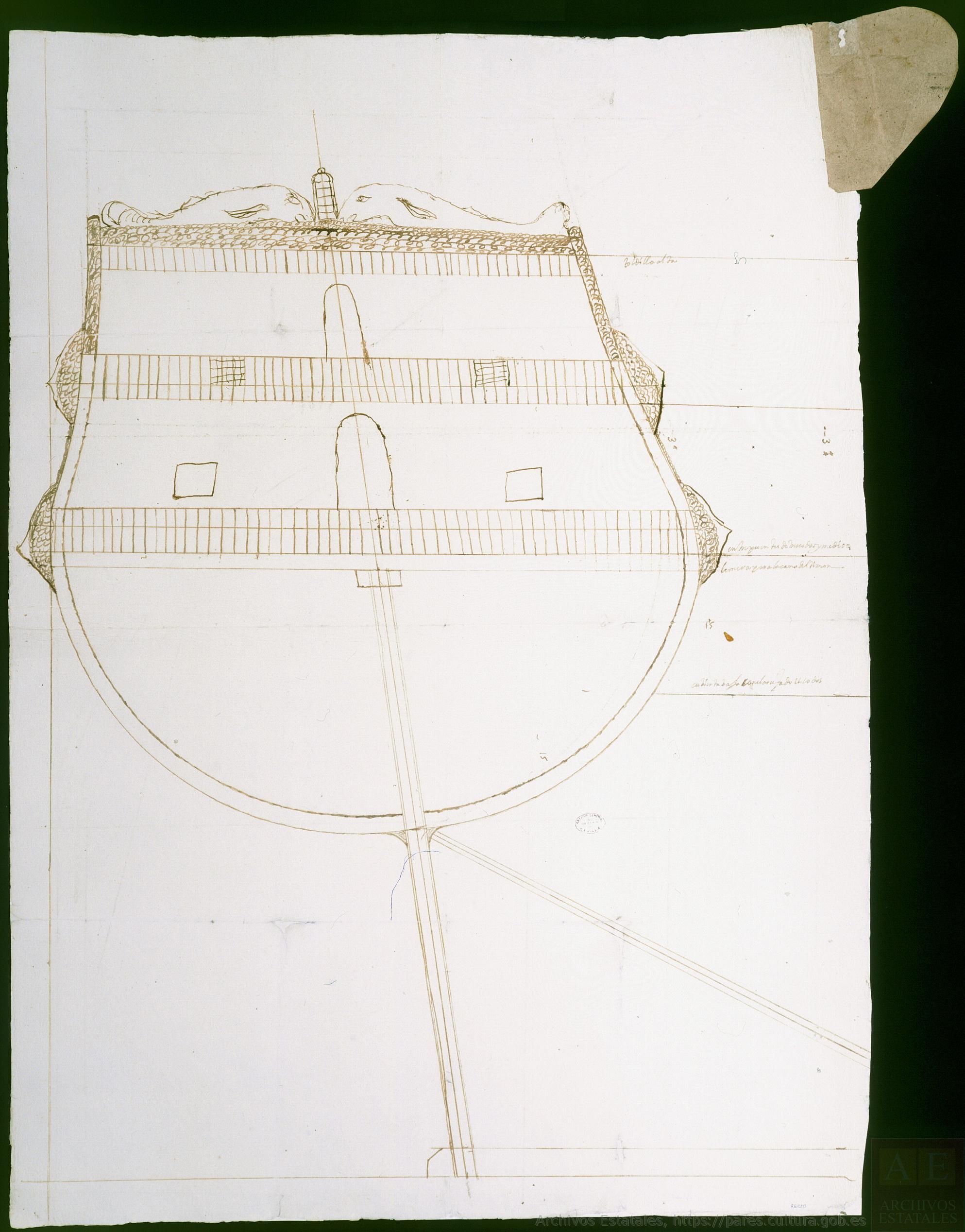
For the first forty years or so of the 17th century, the large or main transom of Spanish galleons was typically “stepped” (in layman’s language), with the upper part or parts overhanging the lower, rather than flat as soon would be the case. The Spanish galleon Santa Teresa, shown in the three images below, is a good example of this style of very common early 17th century Spanish sterns.


The “Vista de Sevilla” (“View of Seville”), circa 1660, artist unknown, gives us a good view of the sterns of Spanish galleons with enclosed galleries, and the changes that came mid-century. The sterns, although still very high, all now appear “modern” in the sense that the double transom, the upper overhanging the lower, has disappeared.


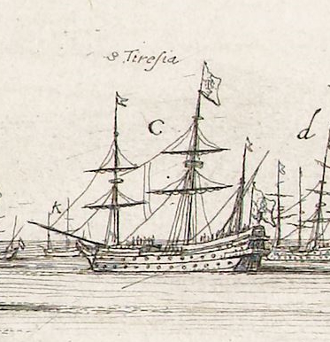
Below is an illustration of “The Spanish fleet sailing from Havana in 1662.” However, neither the Flota de Nueve Espana nor the Flota y Armada de Tierra Firme sailed from Havana in 1662, nor was it likely that either fleet was there at any time that year. More likely, the year was 1661 or 1663. Note the very high sterns of the two larger ships.

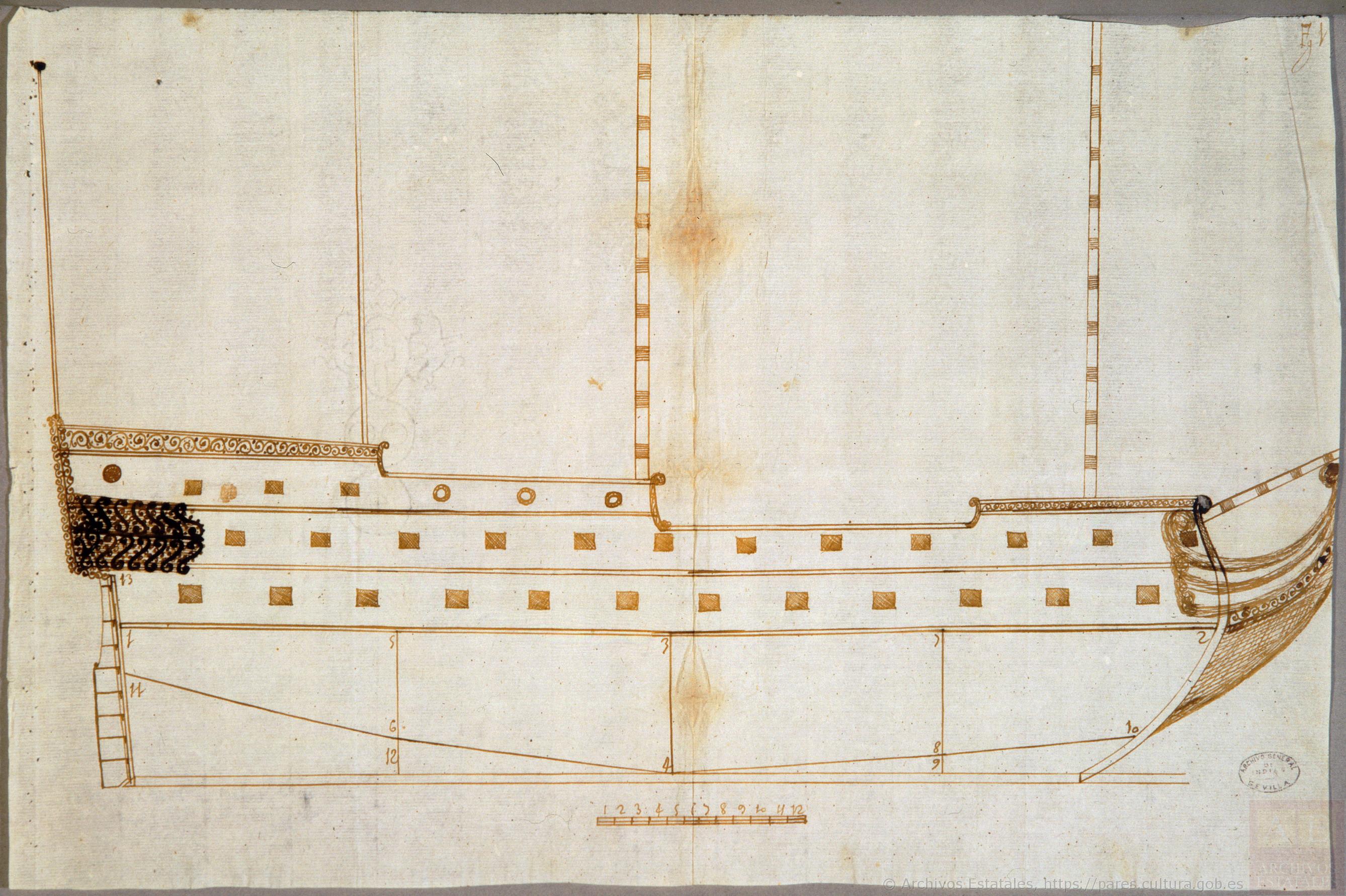
Below is a Spanish two-decker man-of-war, the illustration dating probably to the 1660s, almost certainly the Spanish flagship Nuestra Señora del Pilar given the iconography on the stern. Mounting 64 guns (or 70 in one account), of which 20 were 28-pounders and 28 were 18-pounders (some of which would have been placed on the lower gundeck with the 28s), the ship was destroyed when attacked by four fireships in 1676 at the Battle of Palermo. Admirals Don Diego de Ibarra and Don Francisco de la Cerda perished in the flames along with 200 of the ship’s 740 man crew.
Although a frigate rather than a true galleon, the ship shows many of characteristics of Spanish galleons, and men-of-war as shown below often carried Spanish treasure and escorted treasure ships, earning them the appellation of galleon even if incorrect. Note the high stern, the religious iconography, the clinker planking on the upper-works, the channels mounted above the upper gundeck ports, the musketeer loopholes in the waist (identical to Dutch practice), the jeer capstan on the forecastle, and the two open wraparound external galleries, known as corredores, typical of Spanish treasure ships although not always to be found.

Another Spanish man-of-war stern, 1660s, with two open stern galleries that wrap around the hull. The ship may be the Santa Ana of 54 guns, vice-admiral at the Battle of Palermo in 1676, given the stern iconography. If so, she mounted 16 bronze 24-pounders, 26 bronze 18-pounders (some of which would have been mounted on the lower gundeck with the 24s), and 6 iron 16-pounders. She was likely burned but not destroyed at the Battle of Palermo in 1676.

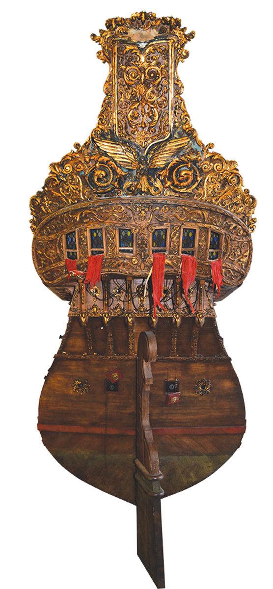
Below are three very similar versions of the galleon Nuestra Señora del Mar, San José y San Francisco, showing details of her shipwreck in the Bermuda Islands in 1691. The ship was launched in Pasajes, Spain in 1681. Of 862.5 Spanish tons (toneladas), she was mounted with only 29 guns, a not uncommon practice for a large Spanish galleon, for much of her space was taken up with cargo. Note the color scheme, the style of painted decoration, the painted scroll-work on the upper-works, and three open external galleries. Each was, per Spanish period references, probably only thirty-three inches deep. The uppermost is at the level of the poop deck or even the poop royal if there is one.


Below, a Spanish galleon with three open stern galleries, flying the royal colors, enters Havana harbor in the second half of the 17th century, probably 1660s to 1680s.

However, in spite of our romance with the open-gallery, high stern Spanish galleon, many did have the open galleries, but had closed galleries, or later, semi-closed, as seen just below in this Spanish galleon at Portobello, 1688.

As noted previously, ships of other nations were sometimes referred to as galleons in the second half of the 17th century, including some of those of Portugal (also occasionally still referred to as carracks as well), Venice, Genoa, and the Ottoman Empire (colloquially referred to as “Turkish” galleons).


The 1680s brought on changes in Spanish shipbuilding, including in its men-of-war and in its remaining true galleons. Although the latter often still had high sterns, they were soon reduced, more in keeping with European construction in general. And although galleons or treasure ships with multiple open, wraparound galleries or corredores were still seen, the enclosed gallery became much more common as did the open gallery, often two or three in number, that did not wrap around to the sides, the latter particularly evident in the 1680s.
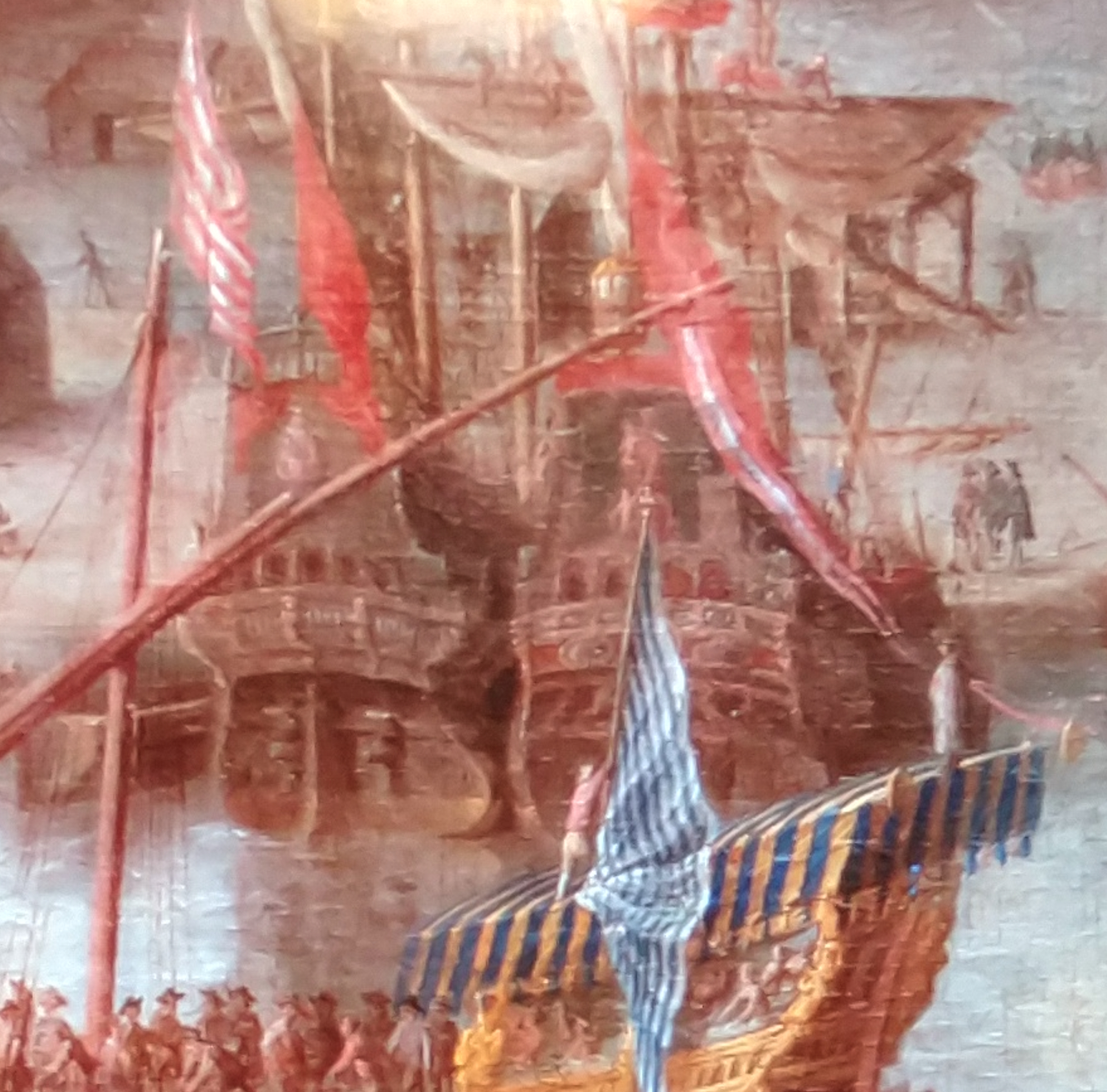
Below are Spanish treasure ships at anchor at Portobello in 1683. The multiple galleries and high sterns are clearly still evident although it appears that not all wrap around the sides but are open only at the stern, as above.

The same treasure ships, or at least ships of the same fleet, at anchor in Portobello in 1682, as drawn by a different artist :

Through the 1680s and 1690s, Spanish men-of-war, which often escorted treasure ships and even carried treasure themselves, were changing, their designs becoming sleeker and more in line with other European navies.

Below is one of a series of proposed Spanish men-of-war, 1691. Although never built, they reflect the new trends in Spanish ship design, including lower sterns and a semi-closed single stern gallery.

Even the last Spanish treasure galleons to be built had similar features. Below is the stern of what scholars generally believe to be the famous San Jose, launched in 1698 and sunk at Cartagena de Indias by Wager’s fleet in 1708, with a treasure aboard estimated by some to be worth as much as 17 billion dollars US today. Compare this drawing with Scott’s painting above of Wager’s action against the San Jose.

With the accession of a Frenchman to the Spanish throne in the early 18th century, over which the War of the Spanish Succession had been fought, Spanish ship design became more contemporary with that of other European sea powers. Gone was the conservatism that too often hindered Spanish shipbuilding. Below is a Spanish treasure ship of the new style. It has a projecting gallery that wraps around the stern (not all Spanish treasure ships and men-of-war had this), with a shade built overhead for the section of the gallery at the transom:
A closer look at these Spanish sterns in the first half of the 18th century. The stern gallery still wraps around the hull.

A simple pen and ink view of a Spanish man-of-war with what appear to be two projecting, probably wraparound, galleries, from a Spanish chart of Isla Vieques off the coast of Puerto Rico, 1721:

Design changes notwithstanding, the high-sterned Spanish treasure ship was in use into the first quarter of the 18th century. I’ve already mentioned Woodes Rogers’s description of one in the South Sea. Below is a depiction of a Spanish treasure ship by Gueroult du Pas in 1710.

And it is these high-sterned Spanish galleons that always have captured our imagination, and continue to do so. Howard Pyle’s famous treasure galleon has helped to keep that imagination not only alive but enhanced. Even the romantically evocative dust jacket below must have been influenced by his famous galleon, with its high stern and colors of sunset or sunrise!

In fact, these iconic images of Spanish galleons from fiction, film, and more aren’t far off from those created by eyewitnesses in the 17th century, including these found on a Spanish 1669 chart of Cartagena de Indias!


Details from “Cartaxena con 46 piésas,” 1669, courtesy of the French National Library.
Copyright Benerson Little 2024-2026. First posted March 27, 2024. Last updated January 25, 2026.

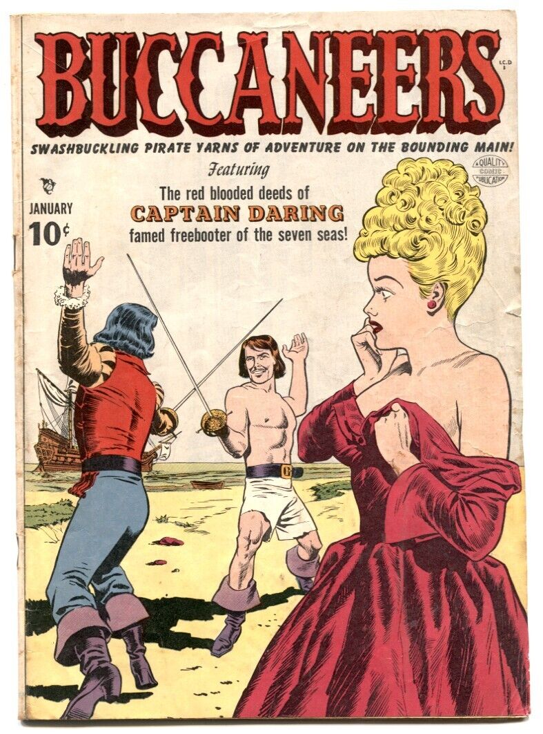
The Duel on the Beach, Part I: In Fiction & Illustration
It’s all too easy to imagine a duel on the beach between pirates or, as fiction and film often have it, between pirate captains. A sandy beach, palm trees, spectators often including both pirates and a woman in distress, a tropical sea and sky–a duel is mandatory in the genre if only because the setting demands one.
This blog post is part one of a likely five part series on the classical piratical duel on the beach, a pirate trope too evocative to pass up and one based to some degree in reality too. Only the trope of the tavern sword brawl is as prevalent, but not as romantic.
Up first is a look at the sandy duel in fiction. Part two examines the duel described by Rafael Sabatini in The Black Swan, in particular the origin of the hero’s singular technique. Part three reviews the duel on the beach in film, part four takes a close look at the most famous fictional duel on the beach, that depicted in Captain Blood (1935) starring Errol Flynn and Basil Rathbone, and part five discusses the historical reality of the duel on the beach.
In particular, we’ll look not just at some classic swashbuckling episodes, but also consider how genres and tropes are created, and how misinterpretation often not only leads us astray, but also, at times, to authentic historical discoveries.

It’s entirely likely that I’ll also throw in a blog post each on the inquartata, the flanconnade, and also the intagliata and similar techniques of “lunging off the line,” given their prevalence in swashbuckling fiction and film (not to mention their utility in historical and modern fencing). I’ve already written one for the same reason on The Night Thrust; or, More Politely, the Passata Soto, and I’ve discussed Sabatini’s hero’s off the line technique in The Black Swan, linked above. I’ll likely also write a brief post on Dutch knife fighting for reasons noted just below.
The series is also part of an effort to encourage outdoor fencing, especially at the beach or seaside. (Don’t worry, any light rust is easily removed from blades! In fact, two or three hours in a sea breeze will start to rust carbon steel.) Not too long ago the FIE (the international fencing body) in its infinite [lack of] wisdom did away with outdoor tournaments in epee, at least as sanctioned events, and national bodies followed suit. Not even the Covid-19 pandemic inspired the dour, sports-rabid international and national bodies to reconsider outdoor fencing. Tournaments held outdoors — at the beach, at historical sites, in parks — are a lot of fun for their own sake, although arguably fencing these days seems more focused on its falsely purported utility as an add-on to college applications than on fun. Some of my fondest fencing memories are of outdoor swordplay, both competitive and recreational, and their associated celebrations.

So where to begin? It seems almost too easy. At least half the blame lays with the highly enjoyable illustrator and writer of out-sized piratical myth, misconception, and trope (and even some fact!), Howard Pyle, several of whose students–N. C. Wyeth and Frank E. Schoonover in particular–followed closely in his swashbuckling-illustrator footsteps.
However, before we get to Pyle in detail, we need to note the existence of an old ballad called “Dixey Bull” or “The Slaying of Dixey Bull” which describes a duel on tiny Beaver Island (near modern Pemaquid Beach, Maine) between a pirate captain and a local fisherman. The ballad was first published in 1907 from oral tradition dating possibly as early as circa 1725 based on its mention of the “skull and cross bones,” language used, and its description of swordplay consistent with early to mid-18th century prizefighting and broadsword technique. The song was sung in Maine and environs, was apparently well-known by seamen and fishermen, and their wives and daughters, and it’s entirely possible that Howard Pyle was aware of its existence.

Dixie Bull was the first-noted pirate of New England and the northeast coast of North America. In 1632 some Frenchmen in a pinnace robbed him of his trading stock of blankets, “ruggs,” coats, &c, for which he sought reprisal at sea in his own small craft. Failing to make good against the French he plundered some local Englishmen, thereby turning pirate. In 1633 three deserters from his crew said he’d gone over to the French, although he is believed to have eventually returned to England.
In the ballad, which has no known basis in reality, as is the case with many ballads of the era, Dixey Bull is challenged by local fisherman Daniel Curtis to a duel with broadswords. If Bull wins, he and his crew keep their stolen treasure. If he loses, the pirate crew returns the plunder and sails away. Wounded, but with a trick worthy of one of Rafael Sabatini’s heroes or the best of those of swashbuckling Hollywood, Curtis kills Bull. Of course, no such duel ever took place: pirates would never offer up their plunder on a point of honor. Whether or not the ballad influenced Howard Pyle is unknown but certainly possible.


Although Howard Pyle painted several sword duels, two of them by the seaside, it’s his “Which Shall Be Captain?” (shown above the Dixie Bull images) that may be the significant culprit, and it shows no obvious connection to the duel between Bull and Curtis. In the painting, two pirate captains struggle against each other with daggers to determine who will command. The notion of dueling for command is false, however, to be discussed in more detail in part five (or if you can’t wait, you can read about it in The Golden Age of Piracy: The Truth Behind Pirate Myths). Put simply, captains and quartermasters were democratically elected. Even lesser officers required the approval of the crew. Dueling was never considered or acted upon as a means to gain command.

Likewise false, or at least uncommon as far as we know, is the use of daggers in duels on the beach. In fact, among buccaneers the musket was usual dueling weapon although some fought with cutlasses. However, there may be a possible exception among Dutch and Flemish seamen, who like many of their adventurous compatriots ashore had a habit of knife fighting, often using their hats in the unarmed hand for parrying. The style of fighting appears to have been more cut than thrust, notwithstanding the Dutch term “snickersnee,” which means to stick or stab and thrust, which Lewis Carroll turned into the snicker-snak of the vorpal sword. (See Buccaneer Cutlasses: What We Know for more information on cutlasses, including a bit on dueling.)
Even so, the only authenticated duel between buccaneer captains was between two Dutchmen–and they used cutlasses. Again, more on this in part five.
A duel on the beach between Dutch pirate captains is likely not what Pyle intended though, unless they were Dutch buccaneer captains of which there were in fact a fair number, more of them in service among French flibustiers than among English buccaneers. Their names are legend: Laurens de Graff, Nicolas Van Horn, Michiel Andrieszoon aka Michel Andresson, Jan Willems aka Yanky, Jacob Evertson, and Jan Erasmus Reyning among many others.
No matter his original intention, Pyle’s scene-setting has been imitated as homage, sometimes even copied, in numerous films as well as in illustrations for swashbuckling tales.

However, Pyle’s painting can only ultimately be said to have inspired the trope to far greater prominence, for a decade earlier, in 1899, Mary Johnston’s To Have and to Hold was published, a romantic novel of ladies, gentlemen, settlers (or invaders), Native Americans, and pirates. Notably, Howard Pyle painted the frontispiece, and, more on this later, Johnston’s works were a significant influence on Rafael Sabatini, author of Captain Blood and many other great romantic, often swashbuckling, novels.

Pyle’s painting of the duel for command, between gentleman hero and the last of three pirate villains he fights one after the other, takes place on what is known today as Fisherman’s Island off Cape Charles, Virginia. All three duels are described not in terms of fencing technique but via the hero’s thoughts and emotions as he fights–and easy way to avoid describing actual swordplay. Side note: the hero’s second adversary is a Spaniard (the best blade in Lima) and the third is the “man in black and silver”–almost as if the duel takes place in The Princess Bride. I won’t add the duel in The Princess Bride to this post, although I’m sorely tempted, as it takes place not on the shore but on the cliffs high above.
The entire composition of Pyle’s painting has been copied by many illustrators and filmmakers, including Douglas Fairbanks in The Black Pirate (1926) and Michael Curtiz in Captain Blood (1935).

As for the action itself, duels in fiction and film require high drama. It helps if the hero and his adversary are equally matched, although often the hero ends up hard-pressed but prevails in the end, often by stratagem. Occasionally we see the hero who is always in control, whose swordplay is so exceptional that the villain comes soon to realize he (villainous duelists are almost always a he, thus the pronoun) is entirely outmatched. Here the drama derives from the villain realizing he’s going to lose and be rewarded as he so richly deserves.
Depicting swordplay in fiction can be difficult, or rather, is actually quite difficult. Explain too much and you lose drama and tempo. Explain too little, and the duel is reduced to vague nonsense, even if dramatic. Using a few modern fencing terms has been the refuge of many novelists–but modern terms lack the flavor, and often the correct historical technique, to adequately depict a historical duel. And even in this case only fencers will actually understand what’s going on. In other words, to understand fencing you must be a fencer (and this is part of the reason, in spite of the FIE’s attempts at dumbing down fencing, why it will never be, and frankly should not be, a great spectator sport). But writers often cheat and describe swordfights only in vague terms or through the protagonist’s mental state.

In related fashion, writers often forget, or far more likely haven’t learned, that fencing on a shoreline causes changes in footwork and agility. Fencing in sand tends to slow the action down a bit, footwork in particular. Lunges are slower because the foot slips even in the best-compacted damp sand. Of course, if the beach is rocky, as in Captain Blood (1935), or covered in various beach and dune plants, this may help prevent the foot from slipping although it may also increase the risk of tripping and falling. Fencing in shallow water can diminish the lunge or even negate it.
Further, sand gets in the shoe, which can affect footwork. Sand is also readily available for villainously throwing in the adversary’s eyes. And, as in the case of all outdoor fencing on uneven ground, there’s always the chance at taking a special form of tempo, that of the brief surprise when the adversary accidentally steps in a hole or runs into a bush or trips over driftwood, or is maneuvered into doing this. Distraction, however brief, can be fatal.

There are partial remedy for these hazards, which I’ll discuss in part five, and, like running in the sand, you’ll at least in part naturally adapt to the best technique over time. (Thanks Bear Mac Mahon for your brief comments and reminders on fencing in the sand. 🙂 )
Sadly, seldom does any of this make it into fictional accounts of duels on the beach. But no matter! It’s the ring and spark of steel on steel while the sun glints off sand and sea we’re after. Which, by the way, is another issue with fencing on the beach: glare, which can easily be used to advantage by maneuvering the adversary into position with his face facing sun and sea, or even a sandy sea breeze…
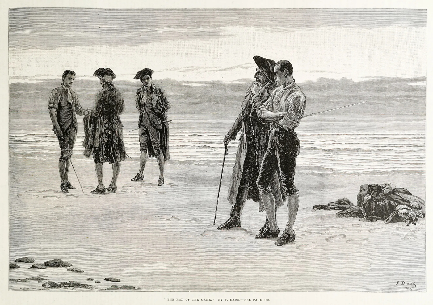
On occasion there artwork of a duel on the beach unassociated with a published story, and even when discovered there is often something of a written description associated with it, as with Frank Dadd’s “The End of the Game” published in The Illustrated London News:

The duel on the beach also makes its way into pirate pulp fiction, as in these novels by Donald Barr Chidsey (the rhythm of whose name makes me think of Simon Bar Sinister):


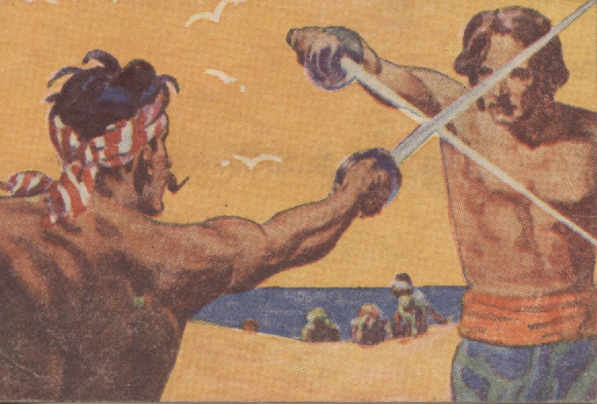
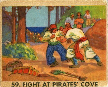
The duel on the beach has had a fair amount of depiction in other print media as well, including comic books and trading cards:
The front cover of Buccaneers (January 1950, #19) showing a duel on the beach, with costumes and en gardes inspired by a combination of several films. Notably, the duelist on the left has an en garde typical of many beginning fencers.
A trading card duel, with buccaneers watching as in Howard Pyle’s paintings and in the films The Black Pirate and Captain Blood.

A duel over buried treasure below, with daggers, clearly inspired by the famous Howard Pyle painting.

Below, a duel for command–a myth, as is the duel or affray over buried treasure.
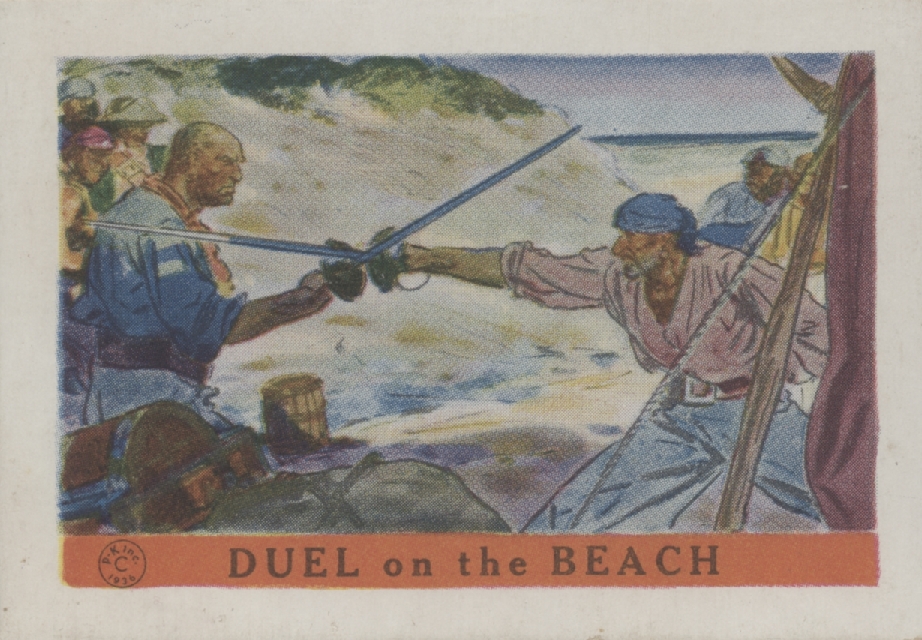

The trading card above probably owes as much to Douglas Fairbanks’s The Black Pirate (1926) as it does to Howard Pyle and various fiction, as shown below–but then, The Black Pirate owes much to Howard Pyle, purposely so according to the film program. We’ll discuss the duel in this film in more detail in part three.

There is a duel on the beach–well, not the beach but on higher ground on tiny Beaver Island, for the “ledges” (rocks) ran down to the water–in Clothes Make the Pirate by Holman Day (1925), a comic pirate novel. The duel is based on the fictional encounter between Dixie Bull and Daniel Curtis but is fought here between two tailors, Tidd and Sneck, both of them impersonating pirates (the former pretends to be Dixie Bull), and the two tailors merely pretend to fight, working out the details while briefly hidden behind some spruce trees during the engagement.

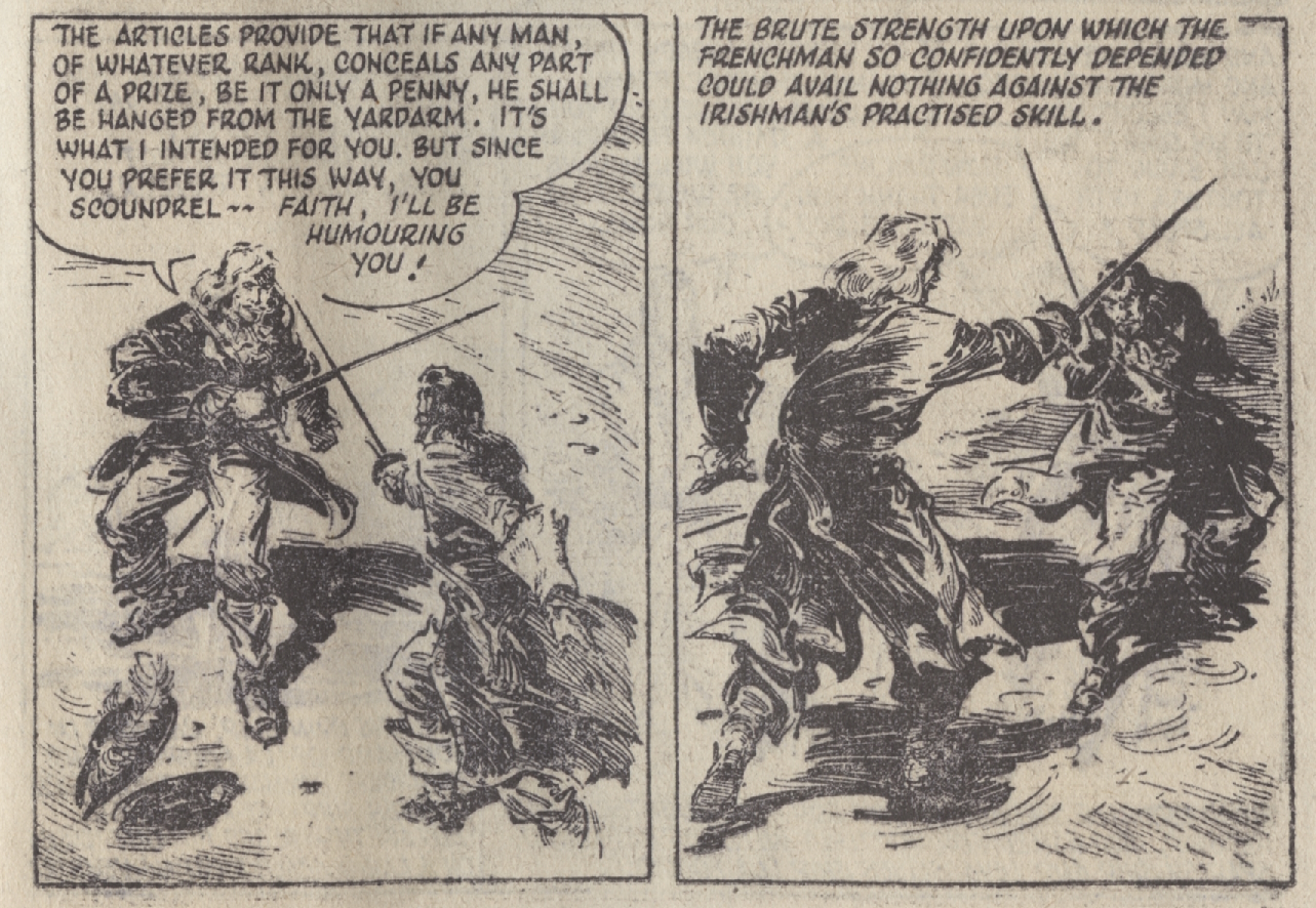
Of course, one of the great duels on the beach is depicted in Captain Blood: His Odyssey (1922) by Rafael Sabatini, in particular the dramatic build-up and famous dialogue. But alas, the duel itself is described in only two lines:
“It was soon over. The brute strength, upon which Levasseur so confidently counted, could avail nothing against the Irishman’s practised skill.”
In part four we’ll look further into this most famous of duels as it was depicted in the 1935 film starring Errol Flynn, Olivia de Havilland, and Basil Rathbone.
Numerous illustrators have tried their hand at the duel, some more successfully than others, historical accuracy (and even fictional accuracy) often to be desired.


This is a good opportunity to segue to several tobacco card illustrations of duels on the beach. Up first is Captain Blood, although based entirely on the duel in the 1935 film.

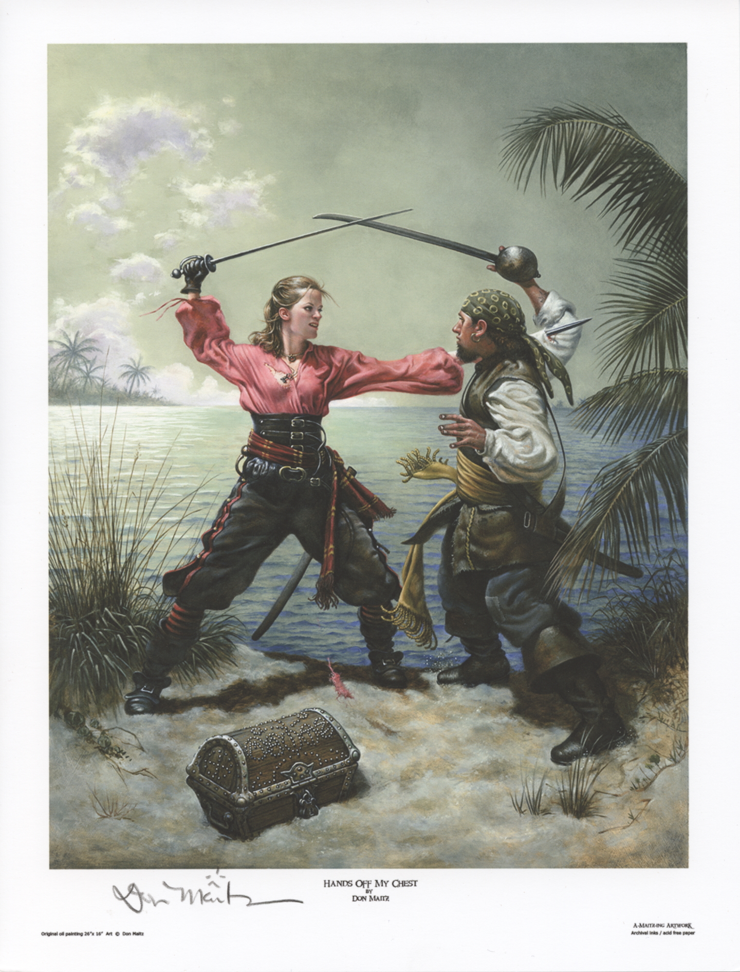
Although I can’t discover any connection to specific works of fiction per se, four of Don Maitz’s paintings of swordplay on the beach evoke classic swashbucklers and the paintings of Howard Pyle and N. C. Wyeth. Mr. Maitz is a famous illustrator, perhaps most noted for his depictions of Captain Morgan for the rum of the same name. Copies of his works can be purchased here.
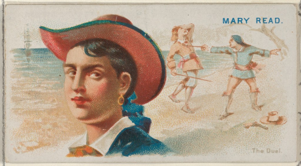
The purportedly authentic duel between Mary Read and a fellow pirate who was threatening her lover (or at least Charles Johnson so claimed, but he lied often in his 1724-1726 chronicle of pirates) shows up in an Allen & Ginter Cigarettes trading card, circa 1888. I’ve included it here as the account may well be fictional.

Norman Price illustrated this duel in The Rogue’s Moon by Robert W. Chambers (New York: D. Appleton and Company, 1929), yet another prolific (roughly one hundred novels, short story collections, and children’s books) popular genre writer already forgotten less than a century later. The story is enjoyable enough even given its light genre and Chambers’s style. It is action-filled and interspersed with scenes of mild titillation, and includes several major characters of the era (Blackbeard among them) in prime appearances, with pirates as the story’s villains. The protagonist is a cross-dressing, seeking-revenge-against-pirates, older teenager named Nancy Topsfield. The novel pretends to a background of historical accuracy, which is in fact, as with most of the genre, only superficial at best.

The duel is brief but exciting, and follows the manner described by Charles Johnson as in use by the early eighteenth century pirates of the black flag: pistols followed by cutlasses. Read’s sword is a “Barbary” or “Arab” blade, which might be a nimcha (of which were some naval captains who owned these swords, usually as trophies) but which the illustrations suggest is more likely a scimitar (or shamshir if you want to be pedantic–but scimitar was the common word in use by Europeans at the time). In either case her blade looks curved enough that she needs to hook her thrust. The duel ends with a near-decapitation.
Although Price’s drawings and paintings of men in the story are reasonably historically accurate by the low standard of popular illustration, he takes pop culture liberties with the leading female characters. He and Chambers dress Mary Read as a typical 1920s/1930s Hollywood starlet-type of pirate, sometimes termed “pirate flapper” and derived most likely from Douglas Fairbanks’s style of dress in his 1926 The Black Pirate. Female pirates were commonly depicted in this fashion during this era, ranging from magazine ads for sterling flatware to Hollywood studio portraits.

Given the rarity of known pirate duels, it’s not surprising that so few are depicted in various literature. However, at least one is. The famous duel, familiar if you’ve read the French edition of Alexandre Exquemelin’s The Buccaneers of America, or other related French texts (or even some of my books), between Laurens de Graff and Nicolas Van Horn at Isla Sacrificios near Veracruz in 1683 is also depicted on a cigarette card. However, given that this duel actually occurred and we have period accounts of it, we’ll save further description for part five. Whoever illustrated the duel below had not read the rare eyewitness account (unsurprising at it is neither easily found nor easily deciphered) although he or she may have read a secondary account, possibly Exquemelin’s.

All of this rather meandering exposition of the duel on the beach in fiction is leading us to a single novel that epitomizes it above all others: The Black Swan by Rafael Sabatini. And, given its role and singular technique, I’ll devote part two of this series to it entirely.

An honorable mention of sorts must go to George MacDonald Fraser’s comic novel The Pyrates (Collins 1983 & Knopf 1984). It’s one of my favorite pirate novels. It’s a campy, loving, satirical send up of pirate fiction and film, including Captain Blood: Fraser was a fan of Sabatini as I was and remain (and as well of Fraser). My attachment is also due in part due to the fact that when I first read it I was a somewhat cocky young naval officer, Navy SEAL, and swordsman recovering on a San Diego beach from an injury received on a Hawaiian beach during deployment.
Fraser’s duel on the beach scene is not traditional. Instead, it is a blindfolded duel between the super Sabatini-esque hero, Benjamin Avery, and the anti-hero Colonel Thomas Blood, a character based on the real quasi-gentleman who stole the English Crown jewels and whose name Sabatini appropriated for his honorable hero. Soon abandoned by the pirates who set them en garde on Dead Man’s Chest (an islet or cay in the Virgin Islands and the inspiration via author Charles Kingsley for said lyric in Treasure Island), the two adversaries fence comically in hoods, with swords tied to their hands and a small bell as well to cue them.
A line or two captures the spirit: “Even Black Sheba, concerned as she was for Avery, could not repress a smile as he came academically on guard, extended himself in a perfect lunge, and fell slap into the surf.”

I’d have to do a more detailed survey of recent fiction to adequately note any other significant renderings in fiction of duels on the beach. At the moment, only one comes to mind, that depicted by famous Spanish novelist Arturo Pérez-Reverte in El Puente de Los Asesinos (2011), part of his excellent Capitán Alatriste series. Alas, there is no English translation. The first six were translated, but not the seventh due to low sales, an indication of where the genre–especially “upmarket” swashbucklers–is today, replaced largely, and sadly, by fantasy.
Much if not most of the swashbuckling fiction that does make it print today tends to fall into the “writing by trope” category with inaccurate historical detail (a problem with much historical fiction in general today, to the point that many authors have accepted fictional tropes as historical fact and will vigorously, even hilariously, defend them) and “dialogue as might be spoken by modern suburbanites at a cocktail party” (likewise a common problem as a journalist friend pointed out), or is sadly relegated to small ebook and print-on-demand presses with little if any access to brick-and-mortar chains and independents. I remain hopeful that this will change. And if I bother to dust off Fortune’s Favorite, the sequel to Fortune’s Whelp, I’ll let you know–it has a duel on the beach in it. In the Caribbean. Naturally. 🙂
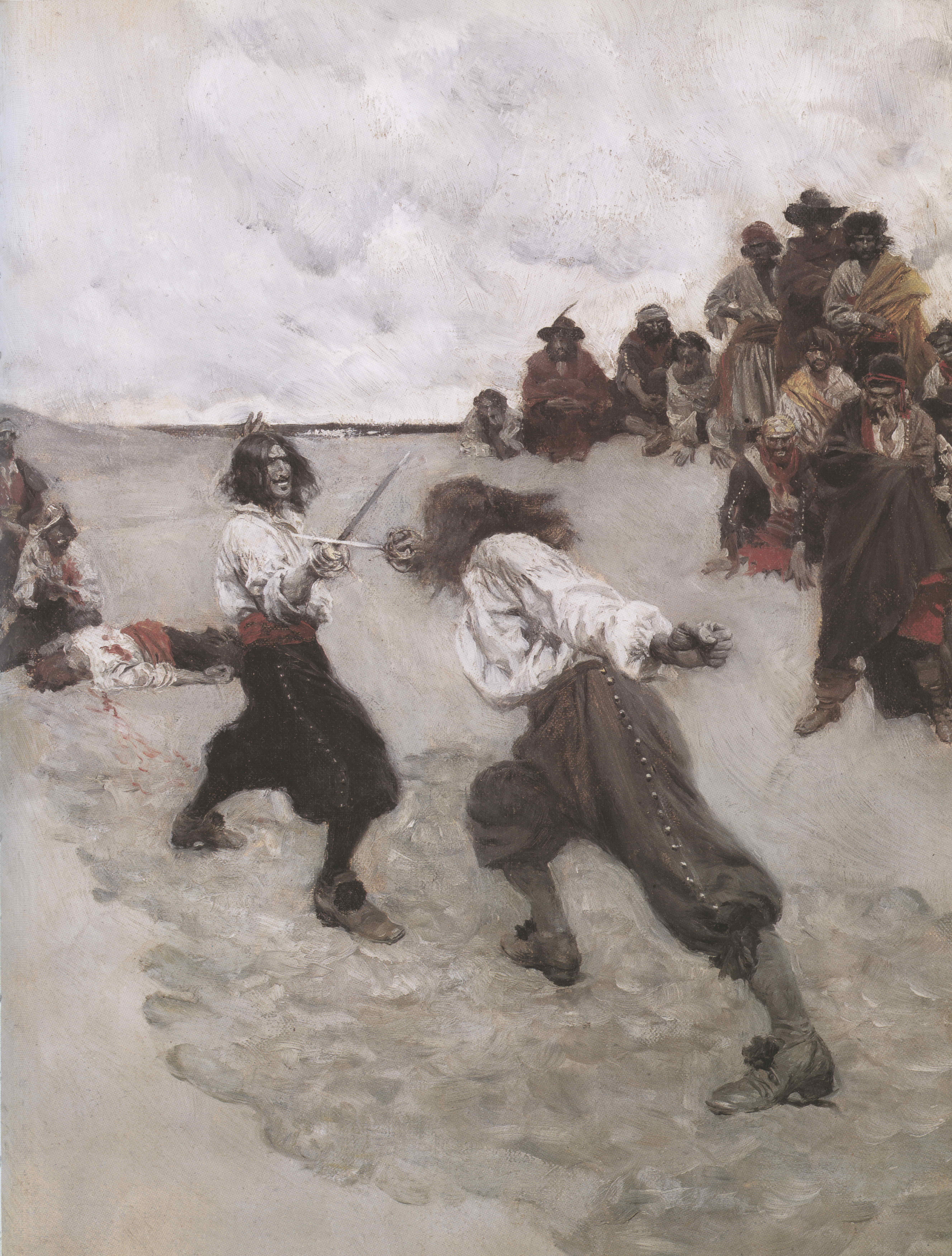
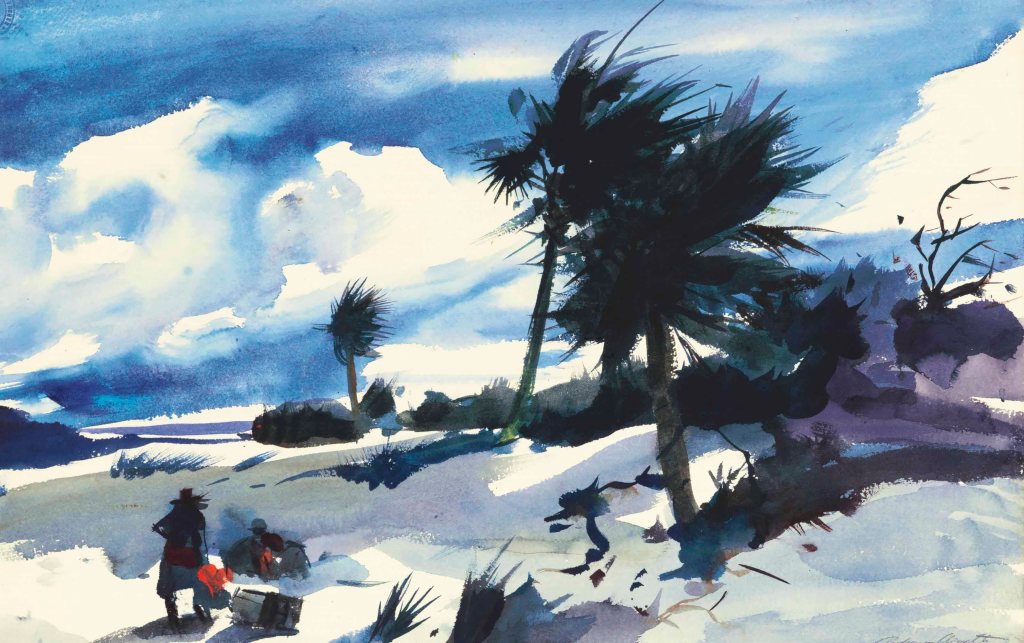
On a more positive note, I’ll close with two watercolors of pirate dueling on the beach, by one of the most famous American painters of all: Andrew Wyeth, son of illustrator N. C. Wyeth, around the age of twenty.


And last, well, just because it’s a beautiful beach painting in the pirate genre by Andrew Wyeth…
NOTES
A couple of notes on the duel at Teviot beach by Howard Pyle: Aficionados of fencing history will note that Pyle clearly took his inspiration from late 19th and early 20th century epee duels, many of which were photographed, and some even filmed. In the late 17th century it would be unusual for there to be a directeur de combat (someone who monitors the fight, in other words, and ensures that no villainy is perpetrated). Further, seconds often fought too, and spectators were absent more often than not.
Even more critically, both swordsmen are in sixte rather than tierce (although one might argue that the fencer on the left is actually correctly in carte, perhaps having just been parried to the outside line by a circular parry). Sixte, not yet called by this name, was not unknown but was disregarded by most masters and fencers in spite of its utility in closing the “light” (hole, open target) revealed in tierce. Sixte is a weaker position and requires more blade set and wrist angulation (some of the latter was later relieved by modifying the way the grip was held) than tierce, which is a stronger position physically and whose point falls naturally toward the adversary’s shoulder. The guards shown in the painting are more typical of fencers in Pyle’s day (and in ours as well).
POSTSCRIPT for members of the Huntsville Fencing Club: post-pandemic we’ll [finally] host a rum tournament on the beach. 🙂
Copyright Benerson Little 2020. First published September 1, 2020. Last updated October 8, 2024.

Jack Sparrow, Perhaps? The Origin of an Early “Hollywood” Pirate, Plus the Authentic Image of a Real Buccaneer

The small caption reads “Cover Drawn and Engraved on Wood by Howard McCormick.” Author’s collection.
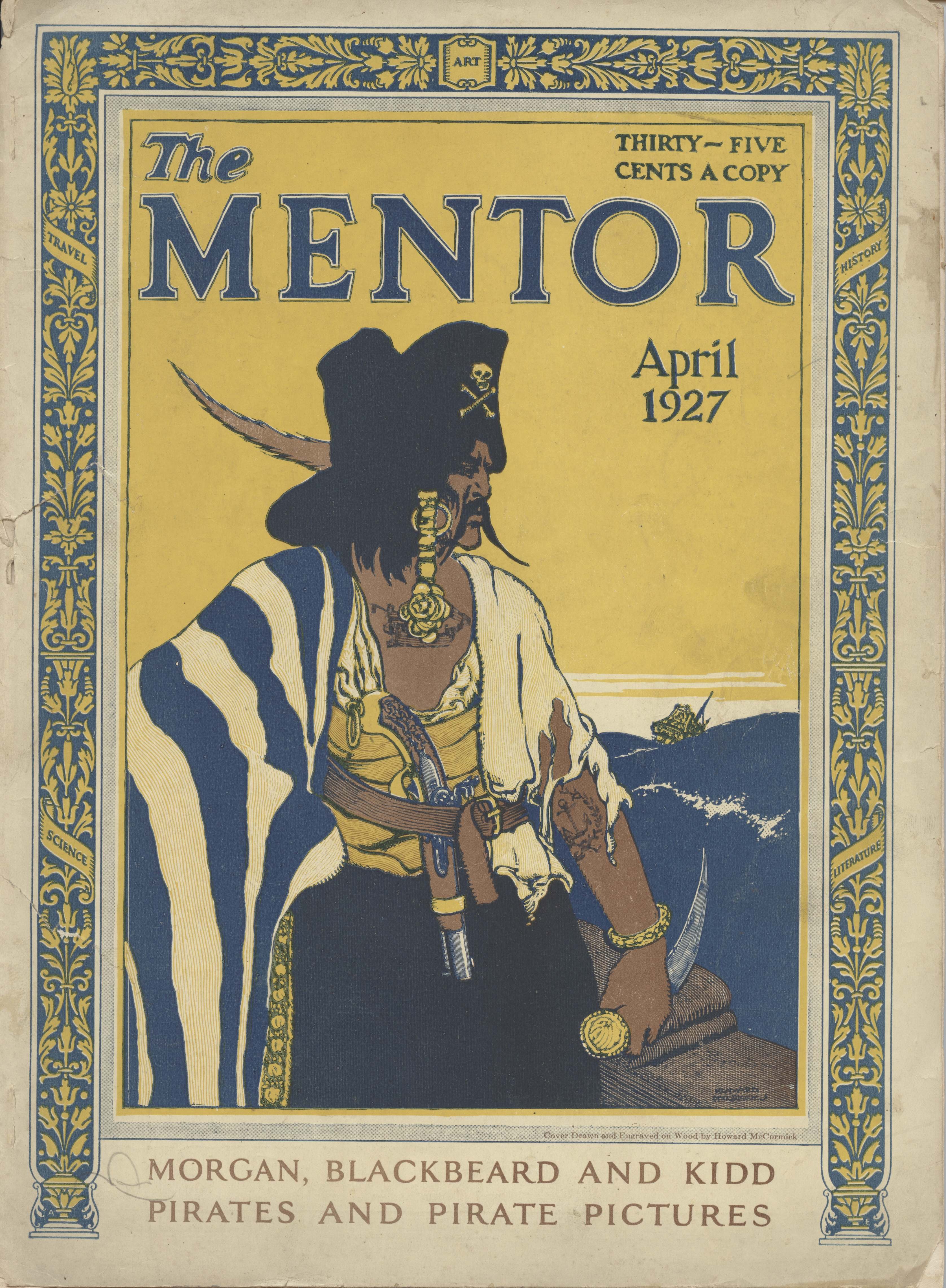
The illustration above was created in late 1926 or early 1927, and published in April of the latter year. Among its several pirate clichés (skull and bones on the hat, tattoos, curved dagger, long threatening mustache) is one I had thought was entirely modern: a pirate hair braid with coins attached.
Quite possibly, this coin braid is the artist’s idea of a pirate “love lock.” The love lock was popular among some young English and French gentlemen in the first half of the seventeenth century. Usually worn on the left side, it was typically tied with a ribbon, a “silken twist” as one author called it. Occasionally two were worn, one on each side as in the image below.

Henri de Lorraine, Count of Harcourt (1601-1666), known as “le Cadet la Perle” due to his bravery in battle. He is also sporting a pair of love locks. Print by Nicolas de Larmessin, 1663. British Museum.
This “pirate love lock” is a noteworthy characteristic of the very Hollywood, very fantasy pirate Captain Jack Sparrow, and I wonder if this image did not inspire much of his look. Historically-speaking, though, there is no historical basis for it among pirates of the “Golden Age” (circa 1655 to 1725), although it’s possible there may have been a gentleman rover or two who wore one during the first half of the seventeenth century–but not a braid or lock with coins.
Of course, much of The Mentor pirate image above was clearly inspired by famous illustrator and author Howard Pyle, as shown below.

Romantic, largely imagined painting of a buccaneer. From “The Fate of a Treasure-Town” in Harper’s Monthly Magazine, December 1905. The image is reprinted in Howard Pyle’s Book of Pirates.

“How the Buccaneers Kept Christmas,” Howard Pyle, Harper’s Weekly, December 16, 1899, a special two-page image. I’ve discussed this image in Of Buccaneer Christmas, Dog as Dinner, & Cigar Smoking Women.

A classic Howard Pyle line drawing, from Howard Pyle’s Book of Pirates.
There’s a hint of N. C. Wyeth too, not surprising given that he was a student of Howard Pyle. However, Captain Peter Blood was a gentleman pirate, and the pirate on The Mentor cover is clearly not.

Battered dust jacket from the photoplay edition of Captain Blood: His Odyssey by Rafael Sabatini, 1922. The cover art and identical frontispiece artwork by N. C. Wyeth.
And Wyeth’s Captain Blood cover is clearly influenced by this 1921 cover he painted for Life magazine. In fact, less the goatee, the two buccaneers might be one and the same:

Details about the painting can be found at the Brandywine River Museum of Art. Oddly, the Life magazine issue has no story or article about buccaneers or pirates.

“The Pirate” by N. C. Wyeth. Pretty much the same pirate as immediately above, less the fictional “pirate boots,” this time painted for Hal Haskell Sr., a Dupont executive who commissioned it in 1929. For years the painting hung in Haskel’s yacht, and afterward to the present in the family home. The print is available from The Busacca Gallery, Art-Cade Gallery, and other vendors.
The Pyle influence continued through the twentieth century in film, illustration, and mass market paperbacks about pirates…

“Pirate Dreaming of Home” by Norman Rockwell, 1924. The painting is also clearly based on Howard Pyle’s famous painting, “The Buccaneer Was a Picturesque Fellow,” and may be intended to represent the same buccaneer later in life, or perhaps is simply an homage to Pyle. (Norman Rockwell Museum.)
The Mentor illustration is also clearly influenced by Douglas Fairbanks’s 1926 film The Black Pirate, which was, according to Fairbanks himself, heavily influenced by Howard Pyle’s Book of Pirates and to a fair degree by Peter Pan.
Seriously, check out Fairbanks’s costume in the film, it’s obviously that of Peter Pan grown up. I have a soft spot for Douglas Fairbanks: my first fencing master, Dr. Francis Zold, described him as a gentleman and a swordsman, and described how Fairbanks invited the Hungarian fencers to his mansion Picfair (named after Fairbanks and his wife, Mary Pickford) after György Jekelfalussy-Piller won the gold saber medal at the 1932 Los Angeles Olympic Games. (N.B. I think Dr. Zold was referring to Fairbanks Sr. as a gentleman and a swordsman, but a nagging itch in my mind suggests that it was Fairbanks Jr. instead.)
Anders Randolf as the pirate captain in The Black Pirate. Note the skull and bones on the hat, the dagger in the mouth, the hoop earring, and, just visible, the tattoo on the chest. Screen capture from the Kino Blu-ray. A useful review of the film is available here.

Publicity still, possibly a frame enlargement from B&W footage given the grain, of the admirable duel on the beach between Randalf and Fairbanks, choreographed by Fred Cavens. More on this in a later blog post. Author’s collection.
And here, finally, we have Johnny Depp as Jack Sparrow in the flesh, braids and such dangling from his hair, again for which there is no historical precedent among Golden Age pirates that we know of. It’s hard to see how Depp’s costume, in particular his hair, might not have been influenced by the illustration at the top of the page. If it weren’t, it’s quite a coincidence.

“Captain Jack Sparrow makes port” from the Jack Sparrow Gallery on the Disney Pirates of the Caribbean website.

Jack Sparrow again, with a closer look at his braids &c. from the Jack Sparrow Gallery on the Disney Pirates of the Caribbean website.
As noted, it’s entirely possible that the Pirates of the Caribbean: The Curse of the Black Pearl costume designers never saw the image at the top of the page. They may have imagined it themselves, or been influenced by something else. A very likely possibility is Donald O’Connor in the 1951 film Double Crossbones, a campy pirate comedy that makes fun of nearly all pirate clichés.
Donald O’Connor in Double Crossbones. Note the braid over his right ear. (Screen capture.)
Although this may seem to be little more than coincidence, there are other similarities between the two films, strongly suggesting the writers and costume designers were familiar with it. In particular, O’Connor plays a shy, somewhat bumbling shopkeeper’s apprentice in love with the governor’s beautiful ward, and she with him. Due to difference in social class he’s unwilling to express his love openly until by accident he becomes a pirate. Sound familiar? Even the costumes of the governor’s ward (Lady Sylvia Copeland, played by Helena Carter) are similar (homage-fashion?) to those of Elizabeth Swann, played by Keira Knightley. If not the Pirates of the Caribbean costume designer, then perhaps the Double Crossbones costume designer was familiar with the image at the top of the page.


Screen captures from Double Crossbones, 1951. Plenty of candlesticks, not to mention a painted miniature around the neck instead of a magical Aztec coin.
And there’s another film possibility: Torin Thatcher (a pirate’s name if ever there were!) as Humble Bellows in The Crimson Pirate (1952). Bellows wears a love knot, perhaps to compensate for his balding pate. It’s surely better than a comb-over! Disney may have been inspired by Bellows’s coiffure, for, like Double Crossbones above, there are numerous homages, shall we say, to the film in the Disney franchise, ranging from the way soldiers march to the “walking boat underwater” scene. It’s also possible that Donald O’Connor’s ‘do inspired Bellows’s.

Torin Thatcher as Humble Bellows in The Crimson Pirate (1952). Blu-ray screen capture.
Of course, all this so far is “Hollywood,” for lack of a better term. There are a number of serious groups of reenactors, scholars, and others trying to correct the false historical image, all with varying degrees of accuracy, agreement and disagreement, and success.
Hollywood has yet to get aboard, no matter whether in pirate films and television series, or often any film or television set prior to the nineteenth century for that matter, probably because it’s easier to play to audience expectations (and, unfortunately, much of the audience doesn’t really care), not to mention that there’s a tendency or even a fad among costume designers to do something that “evokes” the image or era rather than depict it accurately, not to mention the time and other expense of researching, designing, and creating costumes from scratch when there are costumes “close enough,” so to speak, already in film wardrobes.
Here’s a hint, Hollywood: you can start by getting rid of the “pirate boots.” They didn’t exist. They’re actually based on riding boots, and a pirate would only be in riding boots if he were on a horse–and horses aren’t often ridden aboard ship. Further, you can get rid of the baldrics in most cases, exceptions being primarily for gentlemen pirates wearing smallswords into the 1680s, no later. (You can have some Spanish pirates with rapiers wear baldrics after this, though.) And for that matter, you can get rid of wide belts and large belt buckles too. But if nothing else, please, please get rid of the boots, which, if I recall correctly, a UK journalist once correctly described as nothing more than fetish-wear.
Full disclosure: I was the historical consultant to Black Sails, a great show with a great cast and crew, but I had nothing to do with the costuming, much of which is considered as near-blasphemy by advocates of historical accuracy in material culture in television and film. That said, the show is a fictional prequel to a work of fiction that variously created or expanded some of our biggest myths about pirates–buried treasure, the black spot, and so on. Looked at this way, if you can accept the story you can probably tolerate the costuming.
I’ve discussed what real pirates and buccaneers looked like several times, not without some occasional minor quibbling by other authorities. The Golden Age of Piracy has some details, as do two or three of my other books, but several of my blog posts also discuss some of the more egregious clichés, with more posts on the subject to come.
At any rate, here’s an image of a real buccaneer, a French flibustier in fact, from the 1680s. It’s an eyewitness image, one of only a handful of authentic eyewitness images of “Golden Age” sea rovers. It and the others prove that an image may evoke swashbuckling pirates while still being entirely accurate.

One of several eyewitness images of French flibustiers (buccaneers) in the 1680s. These are the only known eyewitness images of Golden Age sea rovers. They went largely unnoticed and without commentary until I ran across them by accident while researching late 17th century charts of French Caribbean ports. I’ve discussed them in an article for the Mariner’s Mirror, and also in these two posts: The Authentic Image of the Real Buccaneers of Captain Blood: His Odyssey by Rafael Sabatini and The Authentic Image of the Boucanier. The posts include citations to the original images.
Copyright Benerson Little 2018. First published January 23, 2018. Last updated April 4, 2018.
Novels with Swordplay: Some Suggestions

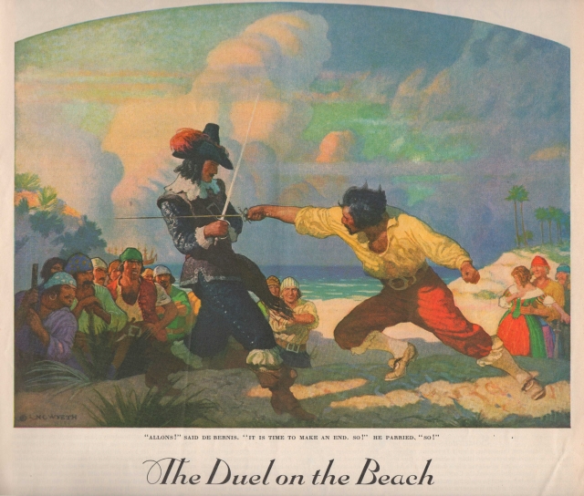
Illustration by N. C. Wyeth from “The Duel on the Beach” by Rafael Sabatini, a short story soon published as the novel The Black Swan. The illustration was also used on the dust jacket of the first US edition of the novel. (Ladies Home Journal, September 1931.)
For your perusal, a list of a handful of swashbuckling historical novels–pirates, musketeers, various spadassins and bretteurs–with engaging swordplay, even if not always entirely accurate in its depiction. If you’re reading any of my blog posts, chances are you have friends who might enjoy reading some of these books, thus my suggestion as Christmas, Hanukkah, or other gifts this holiday season.
Three caveats are in order: all of the following are favorites of mine, all are set in the seventeenth and eighteenth centuries, and all are not “all” in the sense that the list, even narrowed strictly to my favorites, is quite incomplete. Without doubt I’ll add to it every holiday season. And maybe one day a list of swashbuckling films, another of table and board games, maybe even of video games too…
Upon reflection, perhaps a fourth caveat is in order as well: simply enjoy the stories and their swordplay for what they are. Don’t be too critical, especially of the latter. Except for the case of the reader who is an experienced fencer with a strong understanding of period fencing terms and technique (far more rare than you might think), complex historical fencing scenes cannot be written simply and just as simply understood. Nor can technique and actions in general be explained sufficiently for the neophyte to understand, at least not if the writer wishes to keep the action flowing. The writer must strike a middle ground, one that won’t lose the tempo and thus the reader. This is not so easily done.

Victor Hugo–Hugo to most of us, an adopted Norwegian forest stray–with a pair of late nineteenth century French foils with Solingen blades, and a Hungarian mask made in Budapest, dating to the 1930s. Because cats and swords. Or cats and swords and books.
It’s possible the Moby Dick technique would work–explain and teach prior to the event–but it’s just as likely that many readers would shun this, unfortunately. For what it’s worth, Moby Dick is by far my favorite novel and I consider it the greatest ever written. It is not, however, a book for readers who cannot step momentarily away from the narrative. As I’ve discovered after the publication of two of my books in which narrative history is interspersed with analysis and explanation, there are quite a few such readers, some of whom become plaintively irate and simultaneously–and often amusingly–confessional of more than a degree of ignorance when the narrative is interrupted for any reason. To sample this sort of reader’s mindset, just read a few of the negative reviews of Moby Dick on Amazon–not those by obvious trolls but those by apparently sincere reviewers. Put plainly, using Moby Dick as a template for swordplay scenes would probably be distracting in most swashbuckling novels.

Cover and frontispiece illustration by N. C. Wyeth for the first and early US editions of Rafael Sabatini’s Captain Blood: His Odyssey.
In regard to acquiring any of these enjoyable titles, note that some are out of print except perhaps as overly-priced modern print-on-demand editions. Even for those still in print, I highly recommend purchasing earlier copies from used or antiquarian dealers–there are plenty of highly affordable copies, just look around for them. Abebooks is a great place to start, but only if you have no local independent used or antiquarian bookstores available to try first. And these days, alas, there might not be any…
Why an older edition? Because the scent of an old book helps set the period atmosphere. Add a comfortable chair, a sword or two on the wall, a fireplace in a reading room or a fire pit on the beach nearby, and, if you’re of age to drink, perhaps some rum, Madeira, or sherry-sack on a side table, and you’re ready to go. Or Scotch, especially a peaty single malt distilled near the seaside, it will evoke the atmosphere of Sir Walter Scot’s The Pirate. Scotch always works.
So just sit back and let the writer carry you along. Don’t forget to imagine the ring of steel on steel and the sharp smell of ozone after an exceptionally sharp beat or parry. And if you really enjoy scenes with swordplay, there’s no reason you can’t further your education by taking up fencing, whatever your age or physical ability. If you’d rather begin first by reading about swordplay, you can start here with Fencing Books For Swordsmen & Swordswomen. And if you’re interested in how swashbuckling novels come to be–romance, swordplay, and all–read Ruth Heredia’s outstanding two volume Romantic Prince, details below.
Captain Blood: His Odyssey by Rafael Sabatini
Better known by its short title, Captain Blood, I list this first even though there’s really no significant description of swordplay, not even during the duel that is one of the best parts, of many, in the 1935 film version starring Errol Flynn. You must imagine the sword combat, yet in no way does it detract from this great swashbuckling romance that has inspired readers and writers worldwide, not to mention two major film versions (1924 and 1935). It is truly a modern classic. If you really want to judge the quality of the prose, read a few passages out loud: they’re wonderfully lyrical and evocative.
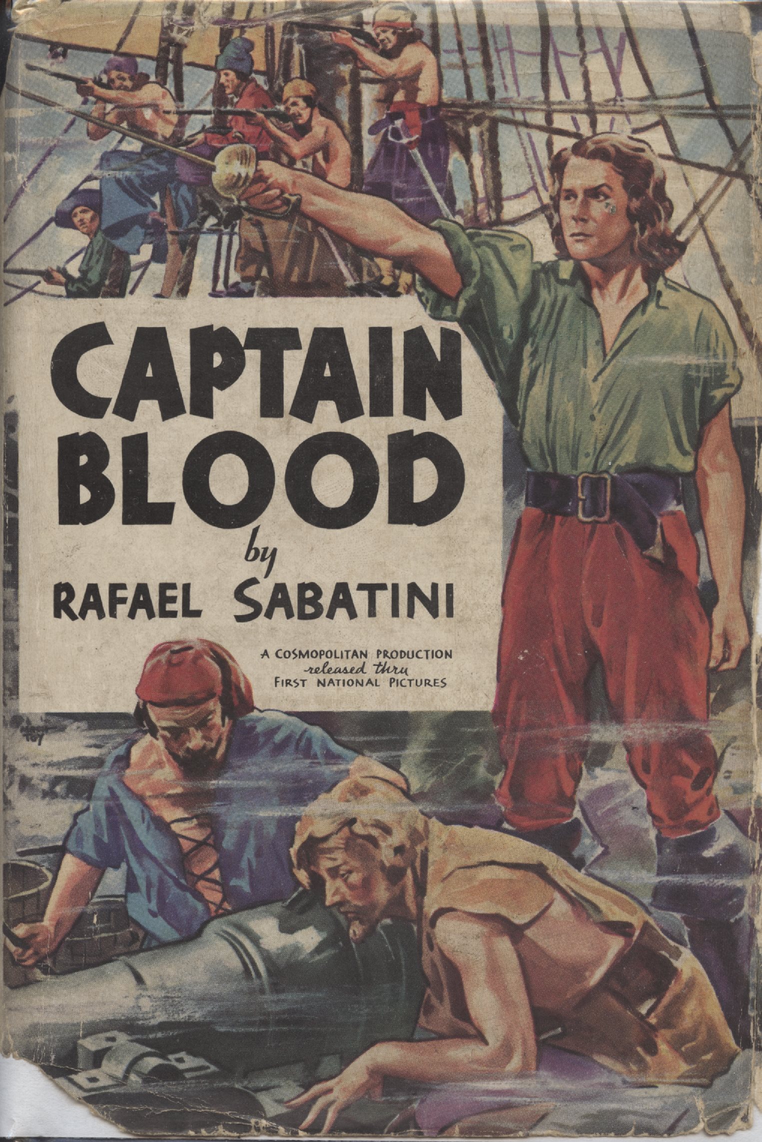
Photoplay edition from 1935, with Errol Flynn as Captain Blood on the cover. Although technically a photoplay edition, the only film images are to be found on the end papers. A nearly identical dust jacket was included with a non-photoplay edition at roughly the same time, the only difference being that the three small lines of film production text are missing.
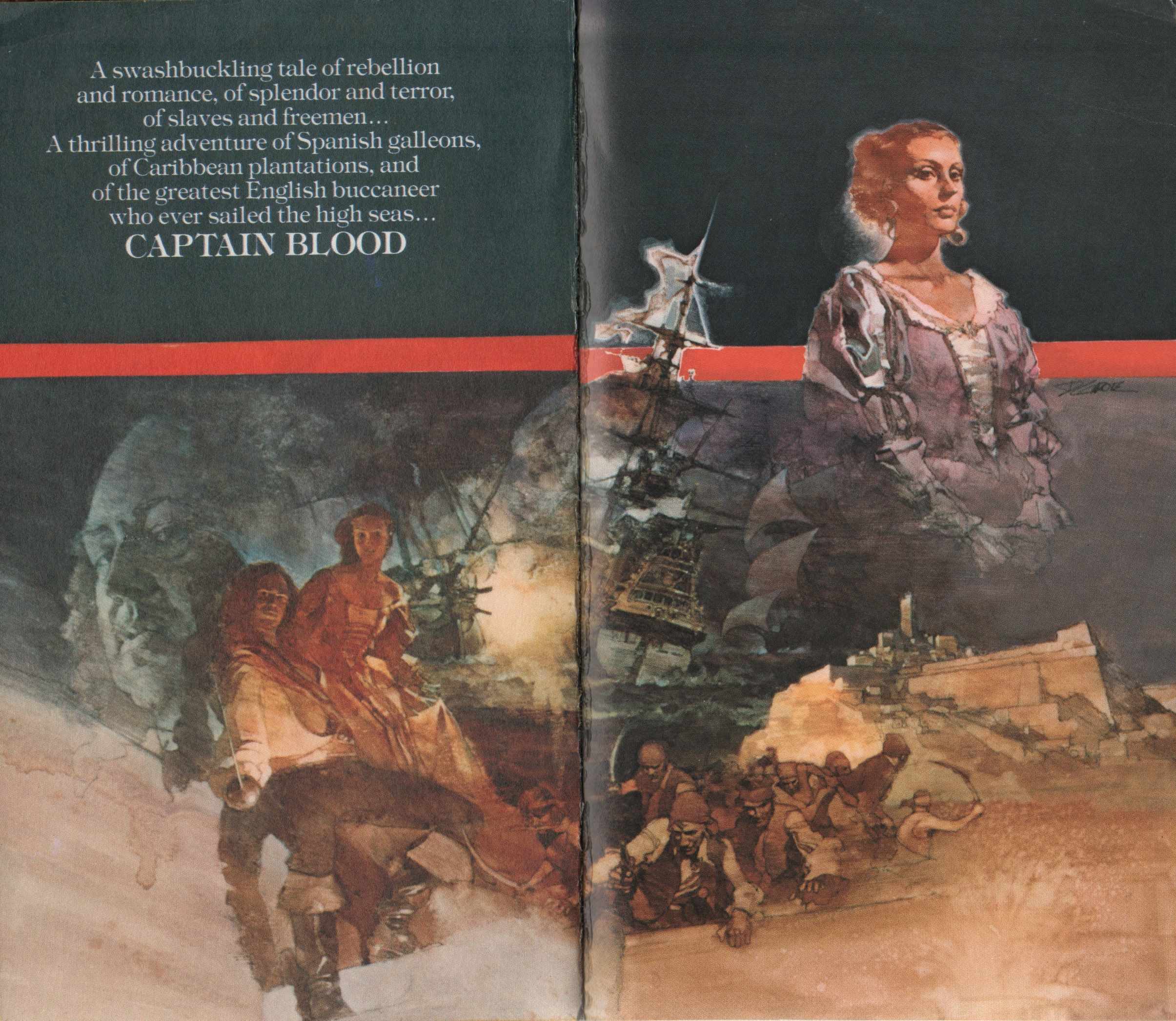
Wonderful artwork from a 1976 US paperback edition of Captain Blood.
Captain Blood Returns by Rafael Sabatini
If it’s a description of swordplay in a tale of Captain Blood, you’ll have to settle for the “Love Story of Jeremy Pitt” in Captain Blood Returns, also known in UK editions as the Chronicles of Captain Blood. Great Captain Blood fare, follow up it with The Fortunes of Captain Blood.

Dust jacket for the first US edition. Artwork by Dean Cornwell.

Endpapers in the first US edition of Captain Blood Returns, artwork by Dean Cornwell.
The Black Swan by Rafael Sabatini
One of the greatest of swashbucklers whose plot leads, line after line, to a dueling climax. The 1942 film of the same name, starring Tyrone Power and Maureen O’Hara, doesn’t do the book justice, not to mention takes great liberties with both plot and character.

Dust jacket, first and early US editions. Art by N. C. Wyeth.

Front cover of dust jacket of first UK edition (Hutchinson).
Fortune’s Fool by Rafael Sabatini
An embittered former Cromwellian officer reassessing his life during the early days of the Restoration–and proper use of the unarmed hand in a sword fight too!

Frontispiece by Aiden L. Ripley to early US editions of Fortune’s Fool.
Venetian Masque by Rafael Sabatini
A novel evoking many of the elements of my Hungarian fencing masters’ own history: spies, duels, intrigue, war, revolution, narrow escapes, and above all, courage. Plus Venice!
“With delicate precision he calculated the moment at which to turn and face them. He chose to do it standing on the lowest step of the bridge, a position which would give him a slight command of them when they charged. As he spun round, he drew his sword with one hand whilst with the other he swept the cloak from his shoulders. He knew exactly what he was going to do. They should find that a gentleman who had been through all the hazards that had lain for him between Quiberon and Savenay did not fall an easy prey to a couple of bully swordsmen…”

Illustration from “Hearts and Swords” in Liberty Magazine, 1934. The story would become the novel Venetian Masque. The illustration has been copied from the John Falter collection at the official State of Nebraska history website. Rather sloppily, in both instances in which Rafael Sabatini is referenced, his name is spelled Sabitini. Even the State of Nebraska must surely have fact checkers and copy editors.
Scaramouche by Rafael Sabatini
“He was born with the gift of laughter and a sense that the world was mad.” Add a sword and you have Scaramouche.
To my mind, a tie with The Black Swan in regard to a novel built around swordplay, and far superior in its scope. Easily has the best–most evocative, that is–description of a fencing salle, hands down.

To Have and To Hold by Mary Johnston
Listed here primarily as representative of the genre at the time (the late nineteenth century) and because it influenced Rafael Sabatini, the novel has most of the classic clichés of the genre, including the duel for command of a pirate ship, something that never actually happened. A gentleman swordsman, pirates, Native Americans, a damsel incognita in distress… The duel takes place, as best as I can tell, on Fisherman’s Island off Cape Charles, Virginia.

Frontispiece by Howard Pyle.

Dust jacket from the 1931 US edition. Illustration by Frank Schoonover, a student of Howard Pyle. The painting is an obvious homage to Pyle’s painting for the original edition.
Adam Penfeather, Buccaneer by Jeffery Farnol
The prequel to the following two novels, you may either love or hate the style in which it’s and the rest are written, the dialogue in particular. Even if you don’t much care for the style–I don’t much–the series are worth reading anyway for the adventure and swordplay, often including sword-armed women in disguise. Farnol will never come close to replacing Sabatini to me, but this doesn’t stop me from enjoying Farnol’s swashbucklers. And at least Farnol’s dialogue doesn’t sound like, to paraphrase a friend of mine, suburbanites chatting inanely at a PTA meeting–a problem with much dialogue in modern historical fiction and television drama.
As for swordplay, Farnol often takes the evocative approach, providing broad strokes to give a sense of the action without providing detail which might confuse non-fencers:
“Once more the swords rang together and, joined thus, whirled in flashing arcs, parted to clash in slithering flurry, their flickering points darting, now in the high line, now in the low, until Adam’s blade seemed to waver from this line, flashing wide, but in that same instant he stepped nimbly aside, and as Sir Benjamin passed in the expected lunge Adam smote him lightly across broad back with the flat of his blade.”
Non-fencing authors take note of the critical vocabulary for swordplay scenes: rang, flashing, slithering, flickering, darting, flashing…

Dust jacket for the first US edition. The first UK edition has a boat instead…
Black Bartlemy’s Treasure by Jeffery Farnol
Great swashbuckling fare, the first part of a two novel series.

Easily one of the most evocative dustjackets on any pirate or swashbuckling novel.
Martin Conisby’s Vengeance by Jeffery Farnol
This quote alone sells this sequel to Black Bartlemy’s Treasure: “So-ho, fool!” cried she, brandishing her weapon. “You have a sword, I mind—go fetch it and I will teach ye punto riverso, the stoccato, the imbrocato, and let you some o’ your sluggish, English blood. Go fetch the sword, I bid ye.”

The Pyrates by George MacDonald Fraser
Enjoyable parody of swashbuckling pirate novels and films, much influenced by the works of Rafael Sabatini and Jeffery Farnol. Fraser, an author himself of wonderful swashbuckling adventure, was a great fan of Sabatini.

The Princess Bride by William Goldman
Requires no description. The swordplay, like that in The Pirates above, is affectionate parody, and much more detailed than in the film.

25th edition, with map endpapers of course!

Nicely illustrated recent edition.
Rob Roy by Sir Walter Scott
Excellent if mostly, if not entirely, historically inaccurate tale of Rob Roy MacGregor told through the eyes of a visiting Englishman. It has a couple of excellent descriptions of swordplay, ranging from a duel with smallswords to action with Highland broadswords.

Le Petit Parisien ou Le Bossu by Paul Féval père
I’m going to pass on Alexandre Dumas for a variety of reasons, not the least of which is that I’ll eventually devote an entire blog to him. If, however, you feel he should be represented here, The Three Musketeers series is where to begin, but you must read the entire series of novels. Be aware that many such series are actually abridged. For a slightly different Dumas take on the swashbuckler, try Georges (an exception to the seventeenth and eighteenth century rule, an almost autobiographical novel in its focus on race and prejudice) or The Women’s War (or The War of Women, in French La Guerre des Femmes). Both are favorites of mine.
Instead, I’ll suggest a great swashbuckler by one of Dumas’ contemporaries. Le Petit Parisien ou Le Bossu is a true roman de cape et d’épée (swashbuckling novel) of revenge from the which the line, “Si tu ne viens pas à Lagardère, Lagardère ira à toi!” (“If you will not come to Lagardère, Lagardère will come to you!”), has passed into French proverb. The novel has been made into film at least nine times, plus into a couple of television versions as well as several stage versions. Unfortunately, I’m aware of only one English translation, and it is excessively–an understatement–abridged. Alexandre Dumas, Paul Féval, Rafael Sabatini are the trinity who truly established the swashbuckler as a significant literary genre.

Bill advertising Le Petit Parisien ou Le Bossu by Paul Féval, 1865. ( Bibliothèque Nationale de France.)
Cyrano de Bergerac by Edmond Rostand
Not a novel, but mandatory reading nonetheless, with one of the two greatest stage duels ever written, the other being that in Hamlet. Wonderful drama, philosophy in action, and sword adventure, including a duel fought to impromptu verse. Like Captain Blood, it is one of the truly inspirational swashbucklers. To be read at least every few years, and seen on stage whenever available. There are several excellent film versions as well.
Theater program, 1898. (Bibliothèque Nationale de France.)
The Years Between &c by Paul Féval fils & “M. Lassez”
Two series of novels of the imagined adventures of the d’Artagnan of Alexandre Dumas and the Cyrano of Edmond Rostand, filling the twenty years between The Three Musketeers and Twenty Years After in the first, and immediately following Twenty Years After in the second. The books are filled with the expected enjoyable affrays and other adventures of the genre, including the usual improbable circumstances and coincidences. The first series consists of The Mysterious Cavalier, Martyr to the Queen, The Secret of the Bastille, and The Heir of Buckingham, published in English in four volumes. The second includes State Secret, The Escape of the Man in the Iron Mask, and The Wedding of Cyrano, published in English in two volumes as Comrades at Arms and Salute to Cyrano.

Comrades at Arms dust jacket of the US and Canada edition (New York and Toronto: Longmans Green and Co, 1930).
The Devil in Velvet by John Dickson Carr
Fully enjoyable read about a modern history professor who travels to the seventeenth century via a bargain with the devil. The professor discovers that his modern swordplay is superior to that of the seventeenth century–a wonderful idea for a novel but otherwise flawed in reality. At best, if the professor were a “modern” epee fencer, there might be parity. But who cares? After all, who can travel back in time anyway except in the imagination? If you’re a fencer well-versed in historical fencing versus modern (again, not as many as you might think, including some who believe they are), suspend your disbelief. And if you’re not, just enjoy the novel for what it is.


Wonderful endpapers!
Most Secret by John Dickson Carr
Pure genre by the famous mystery writer, this time entirely set in the seventeenth century. Cavaliers, spies, and a damsel in distress!

Dust jacket, Most Secret (London: Hamish Hamilton, 1964).
The Alatriste Novels by Arturo Pérez-Reverte
Leaping forward almost two hundred years, the Alatriste novels are a highly recommended recent series by one of Spain’s great novelists, although some critics note that the books are a bit dark. I’d call them realistic. Unfortunately, the latest of the series, El Puente de los Asesinos (The Bridge of the Assassins or The Assassin’s Bridge) has not been translated into English and doesn’t appear likely to be anytime soon, if at all, an apparent casualty of insufficient sales of the previous volumes and a reflection upon the state of the genre at the moment. That the genre should not have a larger readership given the times we live in is curious, but perhaps the audience awaits a few real-life swashbuckling heroes to reappear first. I have read The Assassin’s Bridge, but in French, and enjoyed it. My Spanish is simply not up to the task. The first six volumes are available in English translation. I also suggest The Fencing Master (El Maestro de Escrima) by the same author.

Romantic Prince by Ruth Heredia
For readers seeking to understand how written romances come to be, you can do no better than to read Ruth Heredia’s two Romantic Prince volumes: Seeking Sabatini and Reading Sabatini. The first is a biography of Rafael Sabatini, the second a guide to reading his many works, including some discussion of swordplay. Ruth Heredia is the preeminent expert on all things Rafael Sabatini. Long an officer and significant contributor to the Rafael Sabatini Society, she is a gifted writer in her right, and, in my own experience, an eloquent voice for sanity, empathy, and justice in a mad world. Originally published in now hard-to-find soft cover, her two volumes are now available in revised editions for free for personal use by requesting them from the author. You can find details at attica-ruth.


Fortune’s Whelp by Benerson Little
Last, a blatant effort at self-promotion, although I honestly did enjoy writing the swordplay scenes (not to mention working them out sword-in-hand), and I do enjoy re-reading the associated passages, or at least as much as I’m able to enjoy my own writing (the urge to revise and improve, even after publication, is quite distracting). A sequel, Fortune’s Favorite, is forthcoming, and at least another after it. Then, if all goes well, a series of prequels.

Fortune’s Whelp (Penmore Press, 2015).
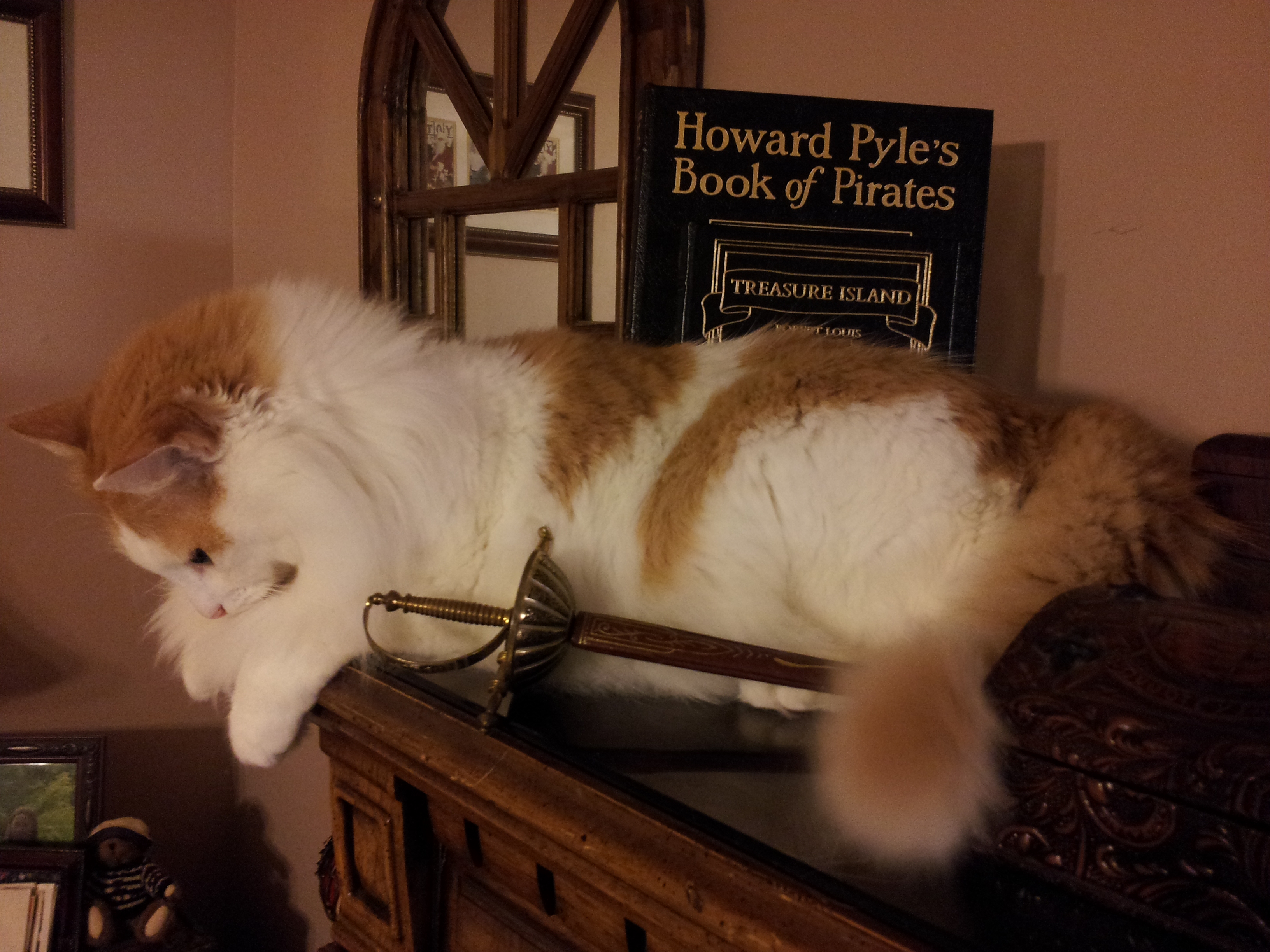
A swashbuckling descendant of sea roving Norse felines. Because cats and swords. If it’s one thing a swordsman or swordswoman can always use, it’s feline grace, tempo, and speed, not to mention sardonic cold-blooded cool.
Copyright Benerson Little 2017. First published December 14, 2017. Last updated April 14, 2020.
