
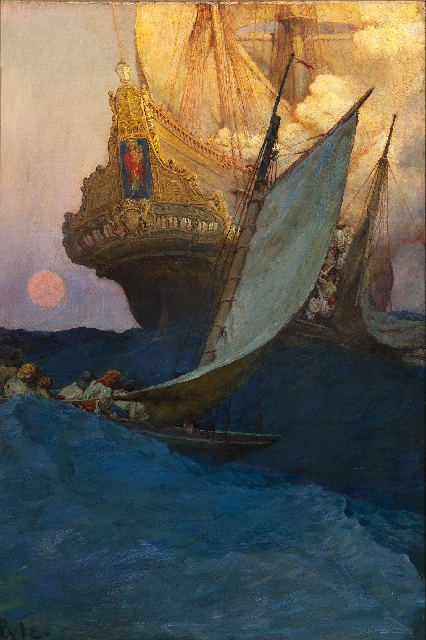
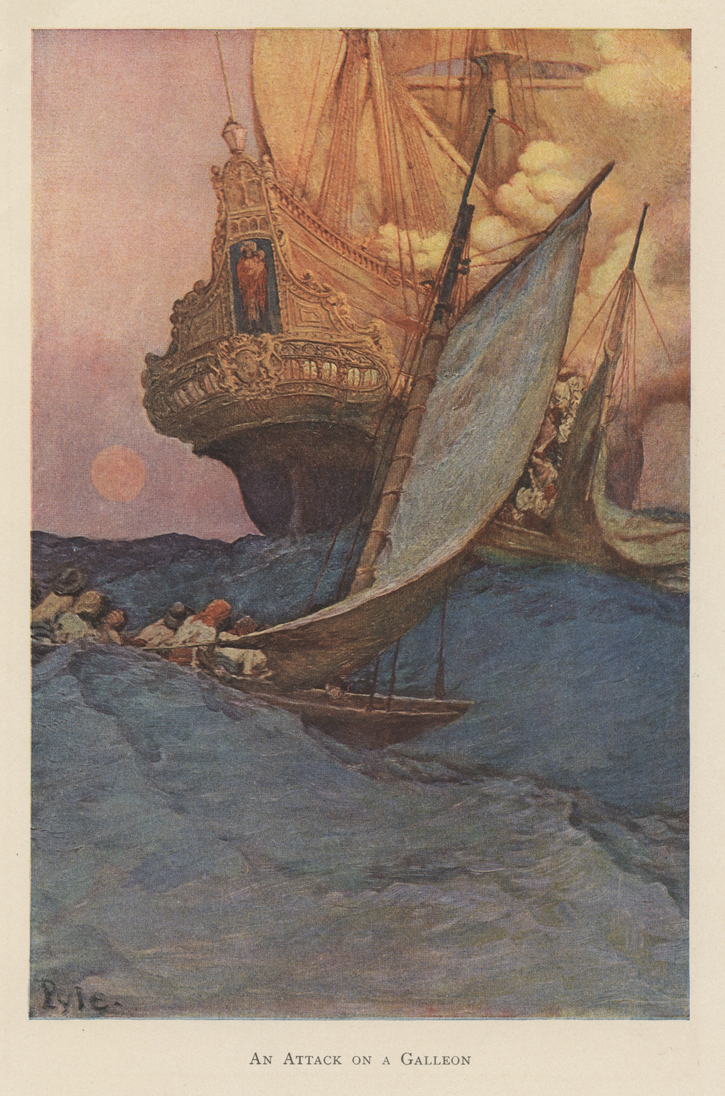
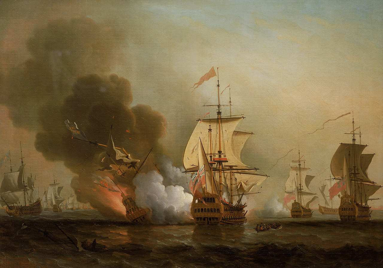
Perhaps the most famous of Howard Pyle’s many piratical paintings and drawings, and certainly the most evocative, “Attack on a Spanish Galleon” has inspired many homages (and plagiarisms) in book illustrations, cinema, and advertising — not mention dreams of Spanish treasure in the minds of both armchair and real sea-going adventurers!
The illustration accompanies several other of Pyle’s most famous buccaneer paintings in “The Fate of a Treasure Town,” an article written by Howard Pyle about the 1697 sack of Cartagena de Indias and published in Harper’s Monthly Magazine, December 1905. The article includes some of Pyle’s most famous buccaneer paintings, including “The Buccaneer was a Picturesque Fellow,” “Extorting Tribute from the Citizens” (used as the cover of The Buccaneer’s Realm, for what it’s worth), and “So the Treasure Was Divided.” Of the most famous paintings of his buccaneer, as opposed to pirate, series, only “Which Shall be Captain?” for “The Buccaneers,” a book of poetry, by Don C. Seitz in Harper’s Monthly Magazine, January 1911, and “How the Buccaneers Kept Christmas,” in Harper’s Weekly, December 16, 1899, are missing.
Charles D. Abbott in Howard Pyle: A Chronicle (Harper & Brothers, 1925) considers these four paintings as the culmination of Pyle’s paintings in “the pirate vein,” although he argues that the painting of “Captain Keitt, standing on the slanting deck of ship with a high sea running behind and a burning galleon in the distance, is perhaps the best of all of Howard Pyle’s pirate pictures.” Even so, he notes that “The one called ‘Attack on a Galleon,’ with its marvelous golds and greens, is a splendid achievement in design.”
Although the attack on a galleon scene in illustration, fiction, and film in general was surely inspired by buccaneer-surgeon-author Alexandre Exquemelin’s The Buccaneers of America (first ed. 1678), Pyle’s was likely factually-inspired by Exquemelin’s possibly apocryphal tale of Pierre Le Grand who captured a Spanish treasure ship by boarding at night. The small buccaneer crew had only one craft and boarded by stealth, catching the Spanish captain and crew off-guard — they had disregarded the distant buccaneer craft as of no threat to a great galleon.
The story may be apocryphal but it has the ring of truth. We know that historically other buccaneers captured Spanish vessels by boarding from small boats, canoes, and periagers (piraguas, pirogues), that sea rovers in general have successfully made similar attacks over the millennia, and that modern naval special operations forces use the tactic as well. (For more information on the tactics of Golden Age buccaneers, pirates, privateers, and naval commerce raiders, see The Sea Rover’s Practice.)
In the painting, one buccaneer boat is already alongside, its boarders streaming up the side and into the waist, and another, gaff-rigged, a dugout canoe perhaps, is captivatingly astern, surely preparing to board as well. The smoke billowing from the deck indicates a fierce fight on deck — muskets and pistols, and probably the upper deck great guns and swivel guns as well, are in action — or possibly even that the ship may be afire, although in the latter circumstance it is unlikely that buccaneers would board, for a fire aboard ship was feared more than any other hazard of the sea.
At the stern, probably on the poop deck, one can sea a Spaniard in a broad Spanish hat, often referred to as a “two-hand hat” (or perhaps it is one of the buccaneers instead?) and aft of him, perhaps on the poop-royal (also known as the topgallant poop, Sp. chopeta/chopa/imperial, Fr. dunette sur dunette/carrosse), a pair of hands in submission and supplication.
A question that continues to perplex me is what time of day does this attack take place? Is that a golden full moon just up over the horizon at sunrise, given its red-orange color? Or is it a sunset, suggesting the setting and settling of a Spanish treasure voyage? Or even of the Spanish Empire in the Americas?

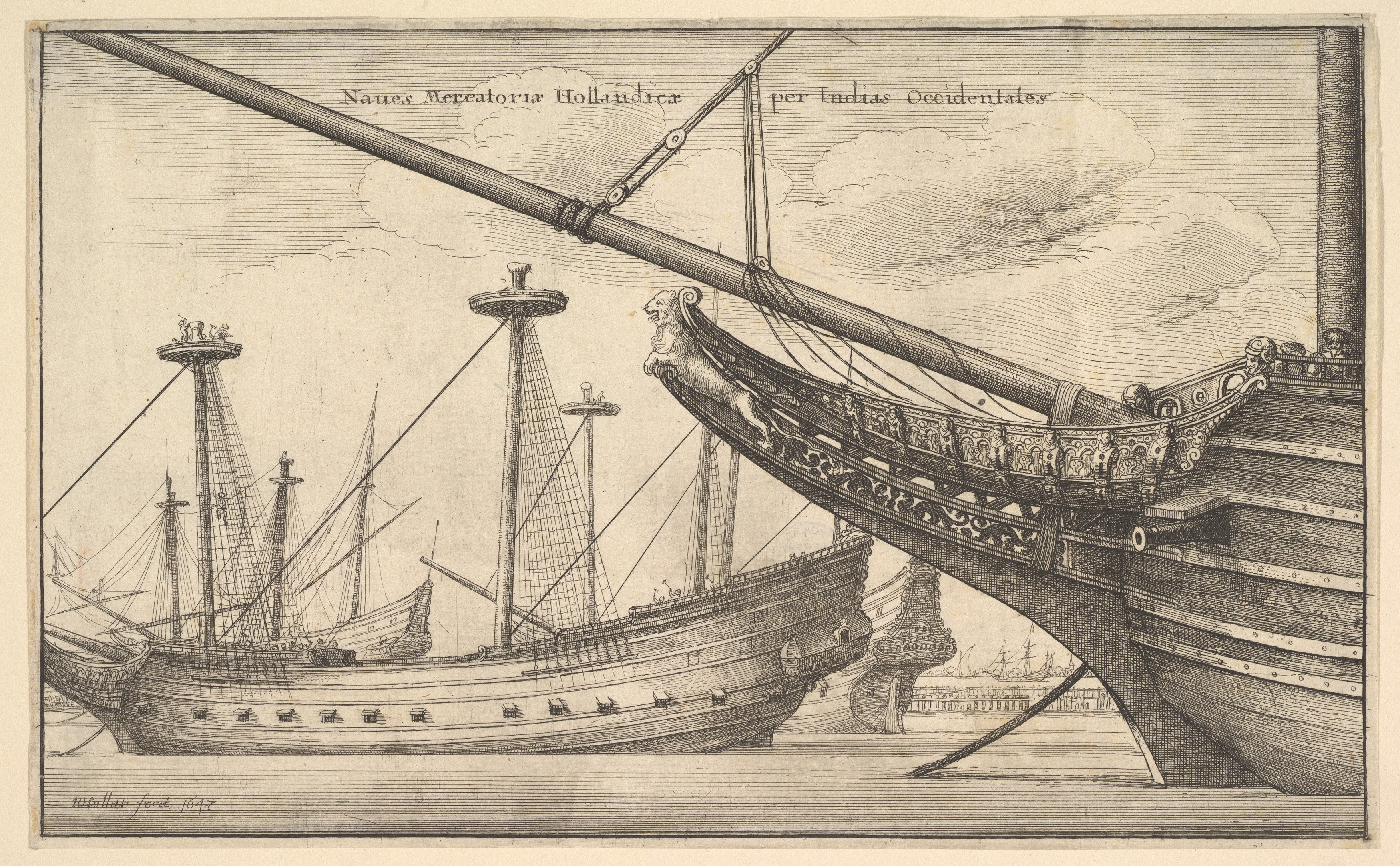
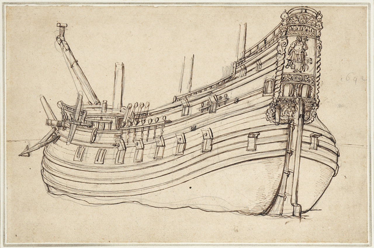
From the left drawing above it’s easy to see that Pyle changed the early conception of the galleon’s stern, eventually elongating it greatly for effect. Even so, the stern is historically-based. Without any doubt, as his inspiration Pyle used the well-known illustration, shown below, by 17th century Dutch artist Wenceslaus Hollar in 1647, and with poetic license narrowed the stern even further. Not only is the Hollar drawing quite similar, but Pyle used it in a later illustration, copying it almost exactly.
The illustrations by Hollar below show a form of mid-17th century Dutch ship used for both East and West India voyages. By the 1660s Dutch sterns, had become a bit lower and less narrow at the upper transom. Even so, some of the East and West India-men shown below, built in the 1640s and 1650s, would have survived in the 1660s and even 1670s or later. Importantly, approximately one third of Spanish ships were Dutch-built, including some treasure ships sent to the Americas, making Pyle’s Dutch-style Spanish galleon historically-correct, or largely so.


In the comparison above, Pyle has largely kept the structure and decoration with minor modification. Importantly and correctly, he has added a large Catholic religious icon representing the ship’s name at the stern. This was the usual practice aboard Spanish ships of the era, nearly all of which had religious names although some had secular nicknames. So far, the only exception I’ve found to the religious name rule is among some Spanish privateers. Occasionally, a religiously-named Spanish privateer or man-of-war might display the Spanish arms as its main icon at the stern, but it would still display a religious icon representing its name somewhere below or above the arms. Here we can assume that Pyle’s galleon’s name begins with Nuestra Señora given that the icon appears to be of Madonna and Child.
It’s possible that Pyle may have been originally inspired by “Wager’s Action off Cartagena, 28 May 1708” by English painter Samuel Scott. Painted at some point in the 1740s, Scott depicts a classical 17th century Spanish galleon, although in fact the galleon in question, the San Jose, whose remains along with possibly a billion dollars in treasure, are currently undergoing careful salvage off Cartagena de Indias, Colombia, probably looked nothing like this. (Details in the section below on real galleons.) In any case, Pyle may have been familiar with this famous painting, and sought out similar but more detailed images, and found those of Hollar. Notably, Pyle’s billowing smoke and orange colors are similar to Scott’s. (Compare with the image of what is probably the San Jose’s actual stern later in this post.)
A word or two on the term galleon. Originally, in the late 16th and early 17th centuries, it referred to a stout ship with specific characteristics that was built for war and trade. Spanish galleons were noted in particular for their very high sterns. By the late 17th to early 18th centuries the term galleon could refer to (1) in its narrowest definition, a treasure ship of a type built to very specific guidelines for use in the Carrera de Indias (the trade to the Spanish Americas from Spain and from the Spanish Philippines), (2) any Spanish treasure ship of any sort, (3) any Spanish ship with a very high stern and multiple stern galleries, and (4) any ship of war or trade similar to those of Spanish galleons, in particular those of Portugal (occasionally still referred to as carracks as well), Venice, Genoa, and “Turkey” (the Ottoman Empire).
Further, some Spanish officials in the late 17th century incorrectly referred to Spanish men-of-war of the frigate type as galleons, retaining language from earlier in the century. True Spanish galleons, as described in (1) were largely no more by the 1640s except for a small number specifically built for the treasure fleets. Arguably, the last true galleons, and there were but few by this time, were built in the 1690s, yet privateer Woodes Rogers in A Cruising Voyage Round the World (1712) describes one in the first decade of 18th century in the South Sea (the Pacific Spanish Main): “[S]he was call’d the Ascension, built Galeon-fashion, very high with Galleries, Burden between 4 and 500 Tun…” He later refers repeatedly to the ship as a “Galleon” — and oddly, to neither of the Manila galleons as galleons, but only one or the other as the “Manila Ship.”
Although the life of a ship in this era was often less than twenty years, some were in use for thirty to forty years, ensuring that older forms of ships were still well-represented.
Pyle also painted a somewhat similar illustration in 1898, published eventually in Collier’s magazine, December 10, 1904, and it clearly shows that his inspiration was taken from Hollar’s Dutch East Indiaman.


Imitations & Homages
Pyle’s galleon, or its inspiration, has spawned numerous imitations, right down to the present. Many, most perhaps, are homages. Below are a few representative images.
His treasure ship has often been used in advertising, for example in this add from The Saturday Evening Post, October 22, 1927, for 1847 Rogers Bros Silverplate. “Time and Tides are Kindly to Comely Captain Housewife,” reads the caption. Sexist, yet the series of ads does feature a variety of often clearly independent pirate women as opposed to more common images of domesticity. Doubtless the illustrations of sexy pirate women were intended not only to attract the attention of women readers, but also as lure to inspire husbands to buy the cleverly marketed “Pieces of Eight” set of silverware and associated pieces.
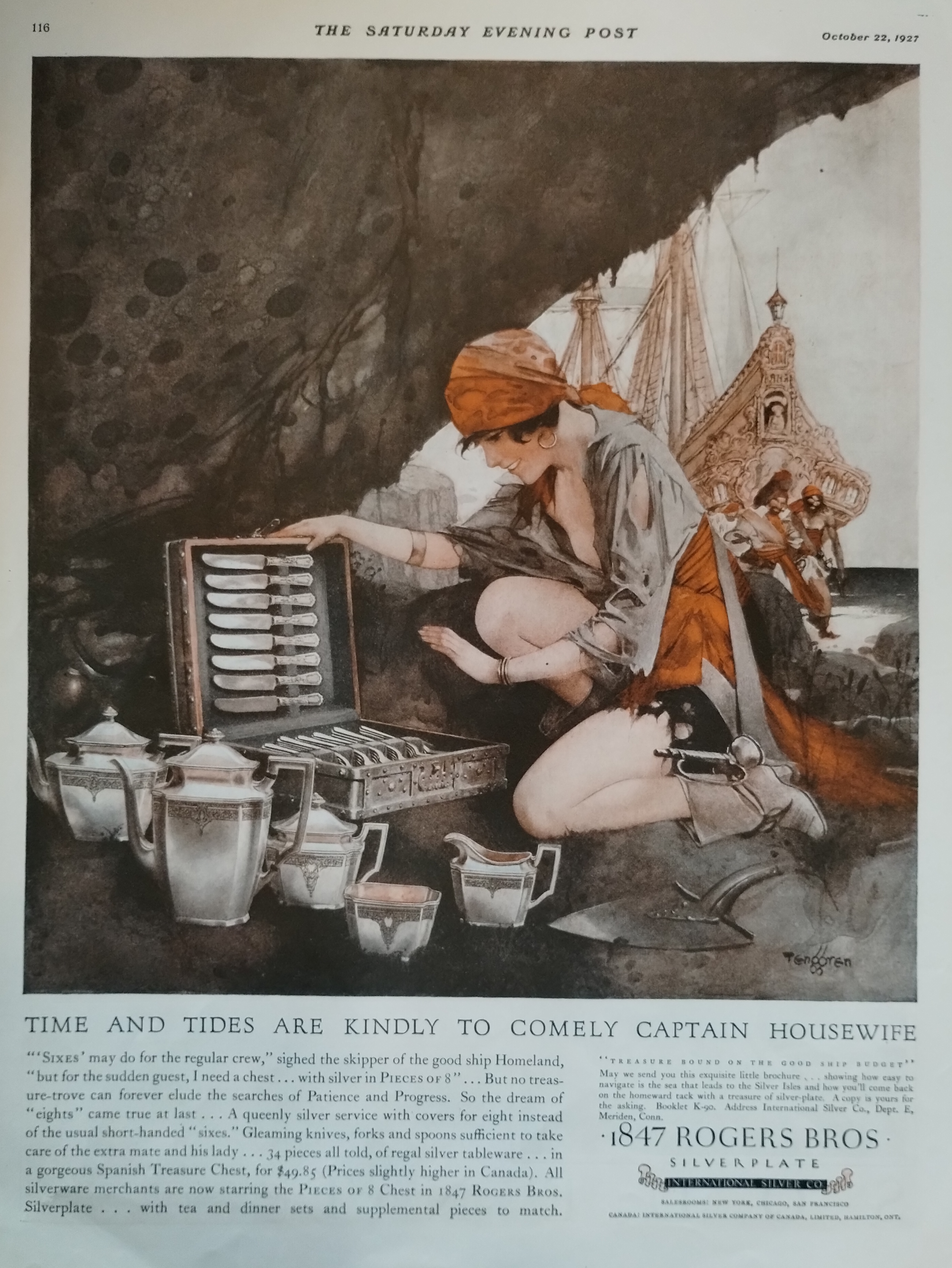
The detail below clearly shows the galleon to be a copy of Pyle’s famous ship. An homage, probably, but also good marketing, immediately evoking the pirates and buccaneers of Howard Pyle and Douglas Fairbanks.

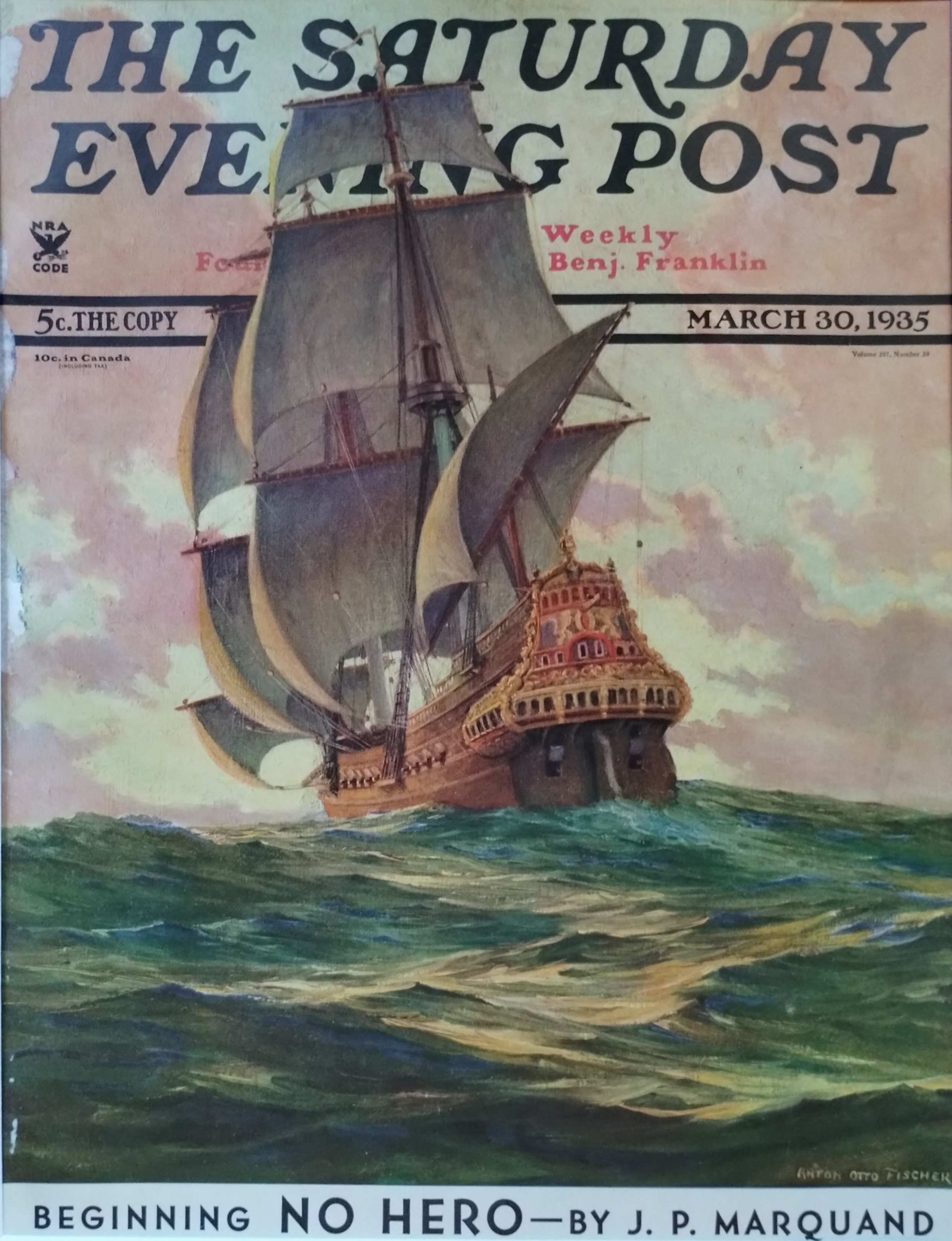
Below is a galleon by well-known Saturday Evening Post artist Anton Otto Fischer, quite clearly in homage to Howard Pyle, based on the galleon in Pyle’s “The Burning Ship” and Hollar’s India-men. The image emphasizes pink-gold hues of ship and cloud and tropical blue sea. Both Fischer and his wife were students of Howard Pyle; Fischer was also an experienced tall ship sailor whose favorite subjects to paint and illustrate were of ships, seamen, and the sea.
A dinner plate dating from 1923 – 1936 — an era of cinematic pirate adventurers Douglas Fairbanks and Errol Flynn, and the buccaneer novels of Rafael Sabatini and Jeffery Farnol — shows likely influence of Howard Pyle’s galleon. That said, as seen above and below, there were real ships with similar sterns.


I almost forgot about several famous galleons, at least one of them an English one, all painted by N. C. Wyeth — perhaps Howard Pyle’s most famous student. All clearly evoke Pyle’s galleon. Homages from student to teacher, without doubt.


I cannot decide if the Cinco Llagas aka Arabella of the 1935 Captain Blood was inspired by Pyle’s painting or not. Without doubt the designers were familiar with Pyle’s galleon, although technically the Arabella is a frigate.

Likewise the Wicked Wench, which was clearly inspired by the Arabella, as I’ve discussed here.

Even so, the galleon — surely the Arabella! — in this 1935-1936 Spanish poster for Captain Blood (Warner Bros., 1935) was copied from or inspired by Pyle’s famous galleon. And appropriately so, given Pyle’s overwhelming influence on pirate films of the era. Note that the forecastle appears to have been appropriated from any of many N. C. Wyeth Elizabethan galleons, or even earlier galleons.

The stern of the Spanish galleon in The Spanish Main (1944) starring Paul Henreid and Maureen O’Hara may well have been influenced by Pyle’s painting, in particular the ascending pointed carved decoration at the top of the stern transom. Compare with that of the Urca de Lima in the television series Black Sails later in the post.
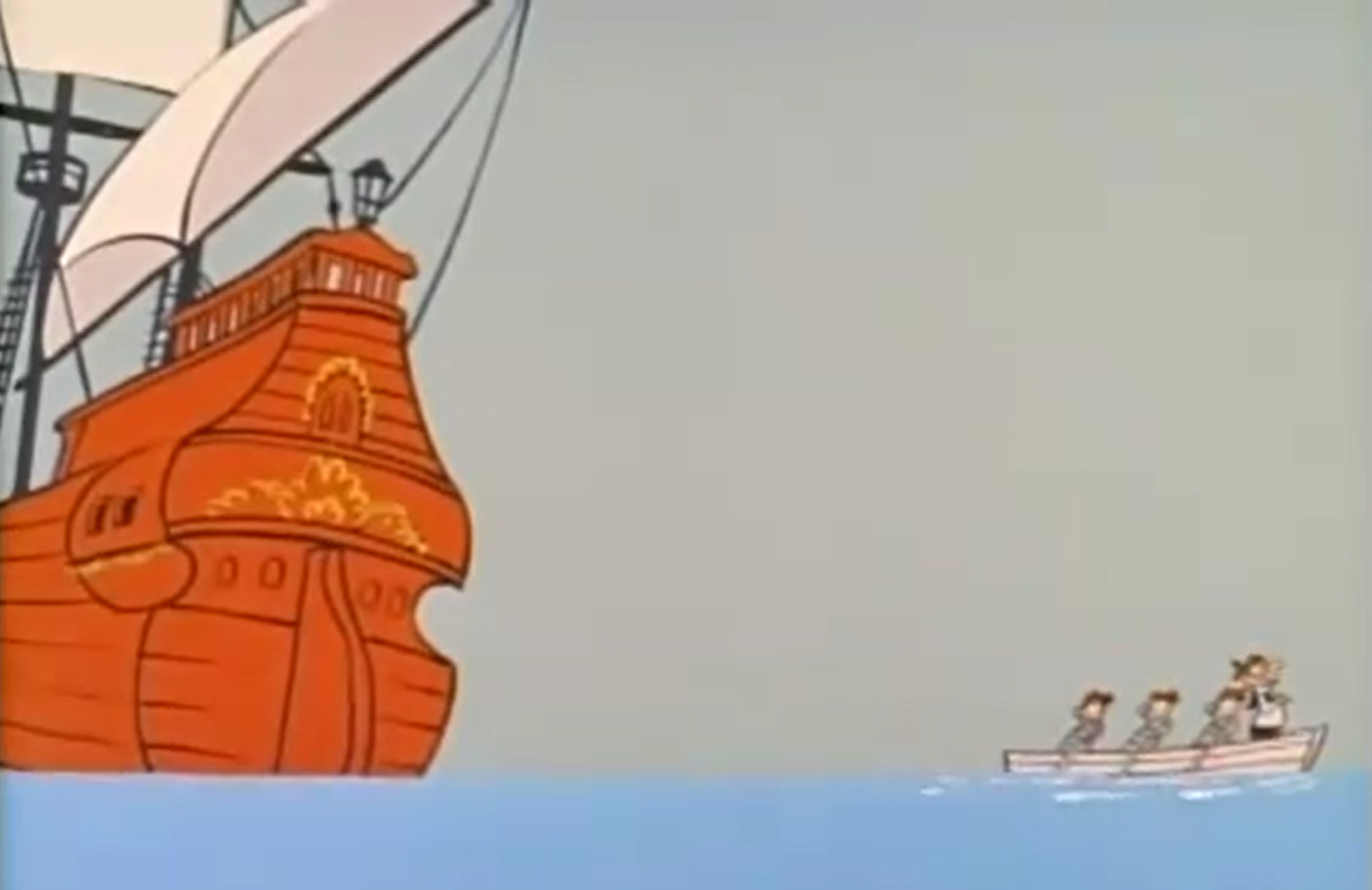
Pyle’s influence is clear in this shot from a Quick Draw McGraw cartoon from 1961:
Famous science fiction and fantasy illustrator Frank Frazetta honored Howard Pyle with an homage to his famous galleon in 1973.

N. C. Wyeth’s grandson, Jamie Wyeth, a famous and outstanding painter in his own right and son of iconic artist Andrew Wyeth, did the artwork for the plate below, a clear homage to both his grandfather and to the man who taught his father, Howard Pyle. In this case it is a “pirate galleon” — clearly a Spanish galleon fallen into the hands of buccaneers per classic trope. (N. B. Buccaneers didn’t fly the black flag with skull and bones, although at least one crew did fly the red banner of no quarter with skull and bones. But it’s the image that counts in storytelling, and we’ve come to expect the black flag on all pirate ships of all eras. See The Golden Age of Piracy for more details.)


Almost certainly the “galleons” (they appear to be manned with English marines) below, especially the one of the left, in this art by cartoonist François Ruyer for a puzzle is an homage to Pyle’s famous painting, with their excessive height and pirates attempting to board one of them via boat. Even the sky color evokes Pyle’s painting.

Likewise an earlier image by Jean-Jacques Loup for Heye, “Captain Flint’s Party,” for a puzzle evokes galleon sterns reaching for the moon, so to speak:

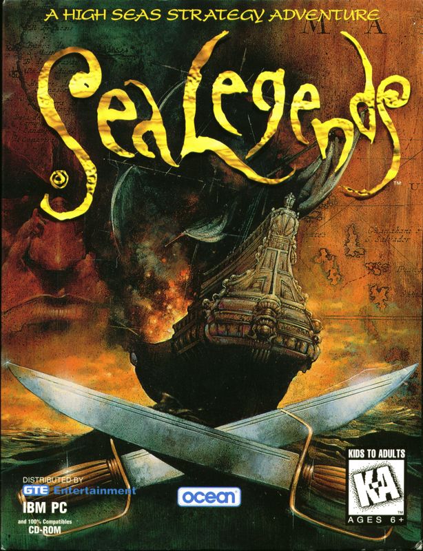
The box cover of Sea Legends (1996), an MS-DOS video game inspired by the 1993 version Sid Meier’s 1993 Pirates! Gold. The Spanish galleon was clearly inspired more by Frazetta space galleon above, in turn inspired by the Howard Pyle.
The stern of the Jolly Roger below from Peter Pan (2003) is clearly an homage to Pyle’s galleon.

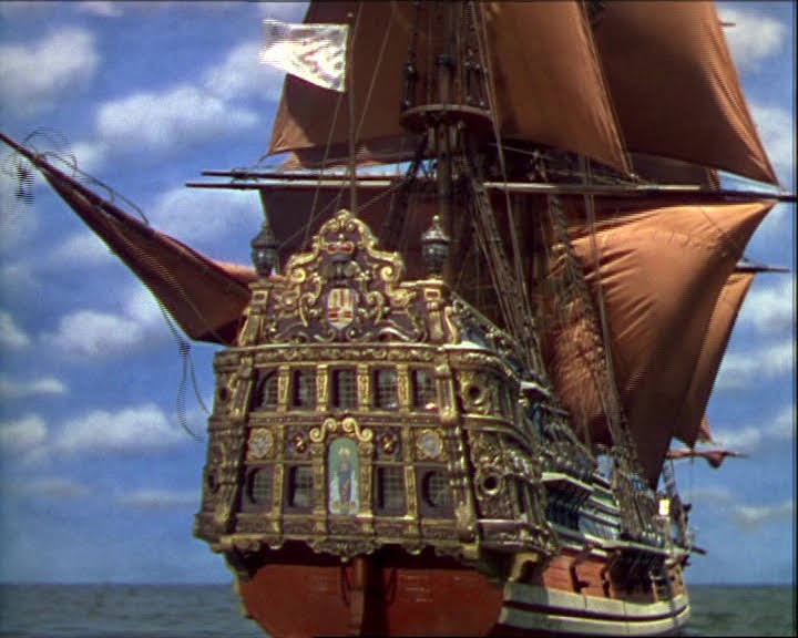
It’s entirely possible that Pyle’s galleon even influenced the design of the Urca de Lima in the Starz dramatic series Black Sails, shown below. (Compare also to the galleon used in The Spanish Main above.) Although I was the historical consultant for all four seasons, I don’t know this for certain as I had no input into sets, including ship design, unfortunately — otherwise the ships might have been more historically accurate. Some of them in reality would not have been seaworthy.
And on a nitpicking the note, urca is the Spanish word for a type of ship originally designed by the Dutch but in use by all Western European seagoing nations. It was known as a fluyt, flute, flutte, or, in English, a pink. It had a rounded stern, not a flat one as the television galleon has, and a very small narrow transom (which might have provided some additional excuse for Pyle’s very narrow upper section of the transom for his Spanish galleon, even though it’s not an urca). In other words, the Black Sails galleon should be an urca instead. It bears noting that an urca is NOT a galleon — yet one might be referred to colloquially as a Spanish galleon if carrying Spanish treasure…


But I digress a bit under the influence of historical accuracy! Even so, this brings us to a good subject: what did Spanish galleons and their sterns actually look like from 1650 to 1700?
Spanish Galleons 1650 to 1700
For the first forty years or so of the 17th century, the large or main transom of Spanish galleons was typically “stepped” (in layman’s language), with the upper part or parts overhanging the lower, rather than flat as soon would be the case. The Spanish galleon Santa Teresa, shown in the three images below, is a good example of this style of very common early 17th century Spanish sterns.


The “Vista de Sevilla” (“View of Seville”), circa 1660, artist unknown, gives us a good view of the sterns of Spanish galleons with enclosed galleries, and the changes that came mid-century. The sterns, although still very high, all now appear “modern” in the sense that the double transom, the upper overhanging the lower, has disappeared.


Below is an illustration of “The Spanish fleet sailing from Havana in 1662.” However, neither the Flota de Nueve Espana nor the Flota y Armada de Tierra Firme sailed from Havana in 1662, nor was it likely that either fleet was there at any time that year. More likely, the year was 1661 or 1663. Note the very high sterns of the two larger ships.

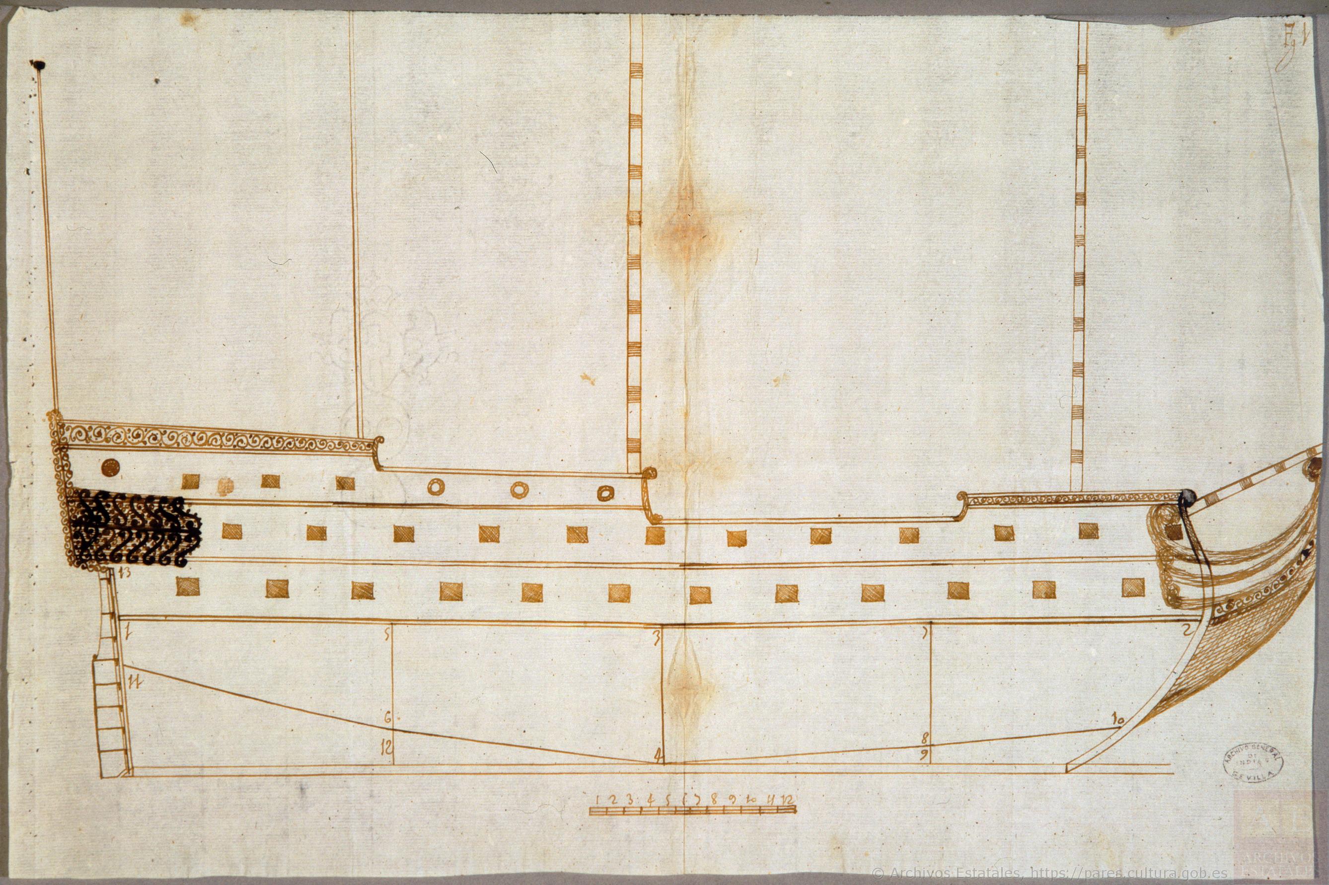
Below is a Spanish two-decker man-of-war, the illustration dating probably to the 1660s, almost certainly the Spanish flagship Nuestra Señora del Pilar given the iconography on the stern. Mounting 64 guns (or 70 in one account), of which 20 were 28-pounders and 28 were 18-pounders (some of which would have been placed on the lower gundeck with the 28s), the ship was destroyed when attacked by four fireships in 1676 at the Battle of Palermo. Admirals Don Diego de Ibarra and Don Francisco de la Cerda perished in the flames along with 200 of the ship’s 740 man crew.
Although a frigate rather than a true galleon, the ship shows many of characteristics of Spanish galleons, and men-of-war as shown below often carried Spanish treasure and escorted treasure ships, earning them the appellation of galleon even if incorrect. Note the high stern, the religious iconography, the clinker planking on the upper-works, the channels mounted above the upper gundeck ports, the musketeer loopholes in the waist (identical to Dutch practice), the jeer capstan on the forecastle, and the two open wraparound external galleries, known as corredores, typical of Spanish treasure ships although not always to be found.

Another Spanish man-of-war stern, 1660s, with two open stern galleries that wrap around the hull. The ship may be the Santa Ana of 54 guns, vice-admiral at the Battle of Palermo in 1676, given the stern iconography. If so, she mounted 16 bronze 24-pounders, 26 bronze 18-pounders (some of which would have been mounted on the lower gundeck with the 24s), and 6 iron 16-pounders. She was likely burned but not destroyed at the Battle of Palermo in 1676.

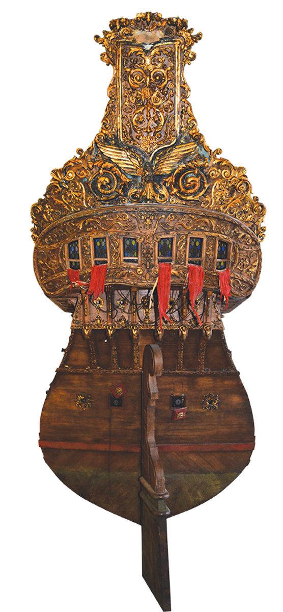
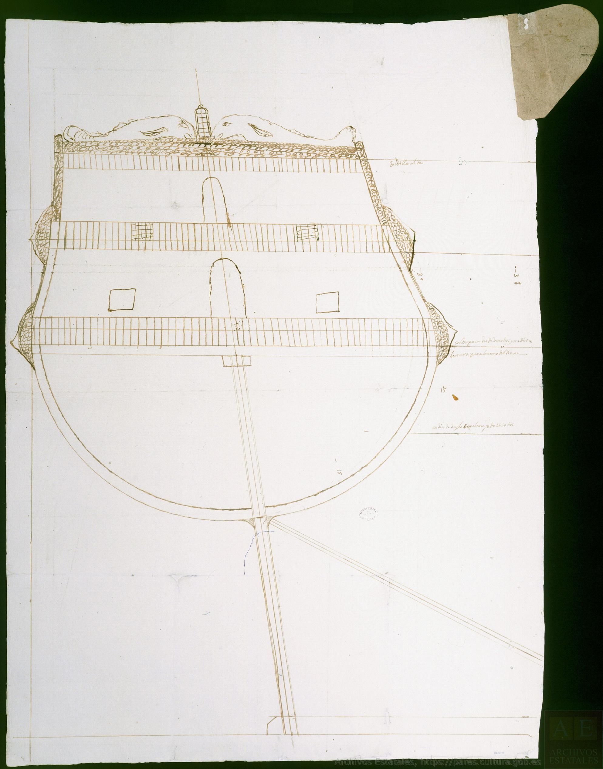
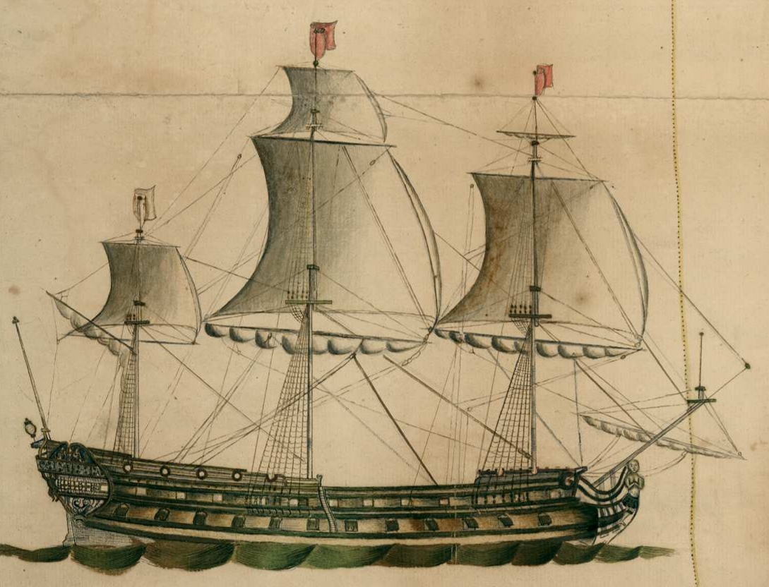
Below are three very similar versions of the galleon Nuestra Señora del Mar, San José y San Francisco, showing details of her shipwreck in the Bermuda Islands in 1691. The ship was launched in Pasajes, Spain in 1681. Of 862.5 Spanish tons (toneladas), she was mounted with only 29 guns, a not uncommon practice for a large Spanish galleon, for much of her space was taken up with cargo. Note the color scheme, the style of painted decoration, the painted scroll-work on the upper-works, and three open external galleries. Each was, per Spanish period references, probably only thirty-three inches deep. The uppermost is at the level of the poop deck or even the poop royal if there is one.


Below, a Spanish galleon with three open stern galleries, flying the royal colors, enters Havana harbor in the second half of the 17th century, probably 1660s to 1680s.

However, in spite of our romance with the open-gallery, high stern Spanish galleon, many did not have the open galleries, but had closed galleries as shown just below in this Spanish galleon at Portobello, 1688.

As noted previously, ships of other nations were sometimes referred to as galleons in the second half of the 17th century, including some of those of Portugal (also occasionally still referred to as carracks as well), Venice, Genoa, and the Ottoman Empire (colloquially referred to as “Turkish” galleons).


The 1680s brought on changes in Spanish shipbuilding, including in its men-of-war and in its remaining true galleons. Although the latter often still had high sterns, they were soon reduced, more in keeping with European construction in general. And although galleons or treasure ships with multiple open, wraparound galleries or corredores were still seen, the enclosed gallery became much more common as did the open gallery, often two or three in number, that did not wrap around to the sides, the latter particularly evident in the 1680s.
Below are Spanish treasure ships at anchor at Portobello in 1683. The multiple galleries and high sterns are clearly still evident although it appears that not all wrap around the sides but are open only at the stern, as above.

The same treasure ships, or at least ships of the same fleet, at anchor in Portobello in 1682, as drawn by a different artist :

Through the 1680s and 1690s, Spanish men-of-war, which often escorted treasure ships and even carried treasure themselves, were changing, their designs becoming sleeker and more in line with other European navies.

Below is one of a series of proposed Spanish men-of-war, 1691. Although never built, they reflect the new trends in Spanish ship design, including lower sterns and a semi-closed single stern gallery.

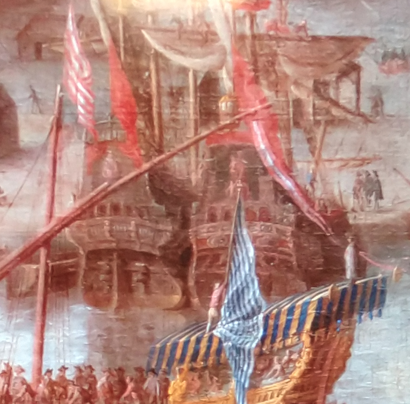
Even the last Spanish treasure galleons to be built had similar features. Below is the stern of what scholars generally believe to be the famous San Jose, launched in 1698 and sunk at Cartagena de Indias by Wager’s fleet in 1708, with a treasure aboard estimated by some to be worth as much as 17 billion dollars US today. Compare this drawing with Scott’s painting above of Wager’s action against the San Jose.

With the accession of a Frenchman to the Spanish throne in the early 18th century, over which the War of the Spanish Succession had been fought, Spanish ship design became more contemporary with that of other European sea powers. Gone was the conservatism that too often hindered Spanish shipbuilding. Below is a Spanish treasure ship of the new style. It has a projecting gallery that wraps around the stern (not all Spanish treasure ships and men-of-war had this), with a shade built overhead for the section of the gallery at the transom:
A closer look at these Spanish sterns in the first half of the 18th century. The stern gallery still wraps around the hull.

A simple pen and ink view of a Spanish man-of-war with what appear to be two projecting, probably wraparound, galleries, from a Spanish chart of Isla Vieques off the coast of Puerto Rico, 1721:

Design changes notwithstanding, the high-sterned Spanish treasure ship was in use into the first quarter of the 18th century. I’ve already mentioned Woodes Rogers’s description of one in the South Sea. Below is a depiction of a Spanish treasure ship by Gueroult du Pas in 1710.

And it is these high-sterned Spanish galleons that always have captured our imagination, and continue to do so. Howard Pyle’s famous treasure galleon has helped to keep that imagination not only alive but enhanced. Even the romantically evocative dust jacket below must have been influenced by his famous galleon, with its high stern and colors of sunset or sunrise!

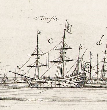
In fact, these iconic images of Spanish galleons from fiction, film, and more aren’t far off from those created by eyewitnesses in the 17th century, including these found on a Spanish 1669 chart of Cartagena de Indias!


Details from “Cartaxena con 46 piésas,” 1669, courtesy of the French National Library.
Copyright Benerson Little 2024-2026. First posted March 27, 2024. Last updated May 23, 2026.


[…] The burning ship is clearly a Spanish galleon, of a style much-used by Wyeth and discussed here. That it has just been plundered is obvious: booty is piled on the poop, including a classic […]
LikeLike
Fantastic article!
LikeLike
Thank you very much!
LikeLike
[…] https://benersonlittle.com/2024/03/27/howard-pyles-famous-an-attack-on-a-spanish-galleon-and-some-re… […]
LikeLike
[…] bring it in line with the film series. But no matter, we’re all familiar with the pirate ship Wicked Wench bombarding the Spanish fort, its sentry box in plain view, even though no pirate ship would ever […]
LikeLike